Showing posts with label Horses. Show all posts

Friday, April 12, 2024

Sculptors

Sometimes, entire museums full of sculptures can be overwhelming and even repetitive. You can only stare at a few busts or nudes in various poses before moving on and walking quickly by. Some of the European museums are jam-packed with similar pieces, with only a few standouts (in my opinion).

I appreciated being ushered through a 2019 tour of the Hermitage Museum by a guide who planned to show us only the most important works of art in the vast collection. I always find myself hunting around for the Rembrandts!

I prefer a middle ground between classical marble statues and grand, ultra modern, abstract installations.

Penitent Magdalene
(1440), Donatello 


I recall learning about Donatello's (1386–1466) unusual wooden sculpture of the Penitent Magdalene (1440) in an Art History class in college. It rather reminds me of melting chocolate. More impressive is how he executed this 6-ft masterpiece without using a chainsaw; it wasn't invented yet!

Unfortunately, we missed the Museo dell 'Opéra del Duomo, where she resides, during our 2011 trip to Florence, Italy.


The Pieta (1498-99),
Michelangelo 


We did get to see Michelangelo's (1475–1564) David while visiting Florence. And, although we splined through the Vatican museums and the Sistine Chapel, the lines to get into St. Peter's Basilica were too long, so we didn't get to see the Pieta. Which one is your favorite?


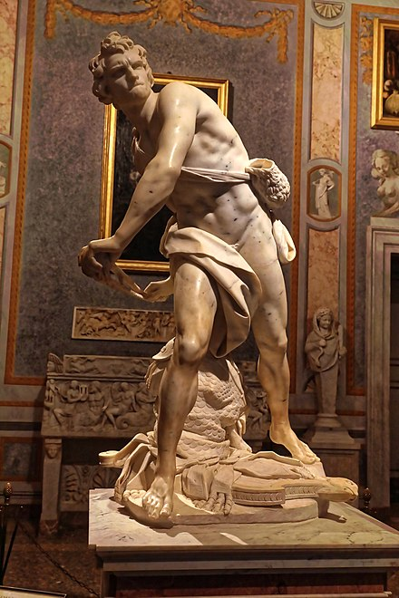
David (1623-24),
Bernini


We missed Bernini's (1598–1680) marble David while in Rome. He's on display at Galleria Borghese. We also missed Donatello's David, which I studied in my art history class. Although Bernini's is more of an action  (sling) shot. I think I prefer Donatello's bronze version.


Degas (1834–1917), although best known for painting ballet dancers and racehorses, he also sculpted them. We saw examples of them at the Ny Carlsberg Glyptotek museum while in Copenhagen, Denmark in June 2019. See my May 2020 post, entitled Sculpture - Another Dimension of Art.


The Kiss (1882),
Rodin
While in Copenhagen, we also saw Rodin (1840–1917) sculptures, though I struggle to remember any. He never actually carved any of his sculptures, instead merely directing other artisans to create them, probably due to poor eyesight. Famous for The Kiss and The Thinker, it was so realistic that he was suspected of surmoulage --  casting directly on the model's body.

More impressive is the Palm Garden and Kai Nielsen's (1882–1924) Mother of Water  (1918-20) as its centerpiece.

Unfortunately, we missed the Auguste Rodin - Displacements exhibit in 2021.


The only Brancusi (1876–1957) sculpture that speaks to me is Suffering (1907), which currently resides at the Art Institute of Chicago. It's an expressive bronze bust of a child. Unfortunately, the image is copyrighted. The Institute is on my bucket list to visit.


King and Queen (1952),
Moore


Henry Moore's (1898–1986) bronze sculpture once resided in Glenkiln Sculpture Park, located in Dumfries, Scotland. While I'd been to Edinburgh, Scotland in 2017, we didn't visit its park either. Lots of sculpture to see all over the UK! My favorite park is Vigeland Sculpture Park in Oslo, Norway, where we visited in June 2019.


Spider (1996), Bourgeois


Surrealist & Feminist artist, Louise Bourgeois (1911–2010) created this creepy Spider sculpture in 1996. I wonder if she was consulted for creating Ron Weasley's nemeses in the Harry Potter movies?

Friday, January 20, 2023

Album Cover Artwork and Designers

Rock Album Covers


Sgt. Pepper's Lonely Hearts Club Band (1967), Blake


Many albums simply use words and photographs of the musicians on their covers, such as the Beatles' Abby Road from 1969 (their eleventh album). In 2017, on our trip to the UK, we visited the Beatles museum in Liverpool, England. One wall was wallpapered with a life-sized copy of the iconic cover photo with the Fab Four strutting in the crosswalk. Even more iconic is the cover for 1967's Sgt. Pepper's Lonely Hearts Club Band, the Beatles' eighth studio album, designed by British Pop Artist Peter Blake (1932-).

This post will examine cover art from a dozen 20th-century designers.


Face Dances (1981), Blake et.al.

I also love Blake's 1981 design of the "Face Dances" cover of The Who members (by row) -- Pete Townshend, Roger Daltrey, John Entwistle, and Kenney Jones -- whose portraits were painted by sixteen artists: Bill Jacklin, Tom Phillips, Colin Self, Richard Hamilton; Michael Andrews, Allen Jones, David Inshaw, David Hockney; Clive Barker, R. B. Kitaj, Howard Hodgkin, Patrick Caulfield; Peter Blake, Joe Tilson, Patrick Procktor and David Tindle. It was featured in my April 2020 post entitled, Op & Pop Artists - From Allegorical Renaissance to Modern Day Optical and Kinetic Art.


Grand Illusion (1977),
Mouse Miller

Blank Signature (1965),
Magritte


American artist Stanley "Mouse" Miller (1940-) is famous for his 1960s psychedelic rock album cover designs for the Grateful Dead, Journey, and Styx. His "Grand Illusion" Styx album is a pastiche (imitation) of Belgian Surrealist René Magritte's Blank Signature.


Felix-Wyeth

Get Happy!! (1980),
Barney Bubbles

English graphic artist Barney Bubbles (1942-1983) was born Colin Fulcher. He is called the 'founding father' of album covers. His Elvis Costello and the Attractions' "Get Happy!!" cover reminds me of the project my fifth graders did for my N.C. Wyeth movement lesson, using repetition of neon-colored shapes.


Swans Reflecting Elephants
(1937), Salvador Dali

Osibisa (1971), Roger Dean

English artist Roger Dean (1944-) designed the 1971 album for British afro rock band Osibisa. The elephant head butterflies remind me of Swans Reflecting Elephants (1937) by surrealist Dali (1904-89).


Playground Psychotics (1992), Schenkel


I like the color scheme of the Frank Zappa and The Mothers of Invention album, Playground Psychotics, which was released in 1992. Designed by Cal Schenkel (1947-), I appreciate his black-and-white drawings of band members and  Zentangle-like doodles (e.g., spirals). This is what I imagine an album cover would look like!


Powderfinger - Golden Rule (2009), Thorgerson


Storm Thorgerson (1944-2013) designed this simple cover for the seventh and final studio album, Golden Rule, by Australian rock band Powderfinger in 2009. Their 2010 album, Sail the Wildest Stretch, also sports a more vivid version of the bird on its cover. Journey also uses a bird symbol on their albums. I wonder if the Australian band chose its name after Neil Young's 1979 song, Powderfinger.


Jazz Album Covers

Tequilla Mockingbird (1979), Glaser


The 1979 Ramsey Lewis cover "Tequilla Mockingbird" was produced under the direction of Paula Scher and John Berg and illustrated by Milton Glaser (1929-2020). I like its simplicity and movement with its bright rainbow colors against a black background. The jagged lettering of the title deconstructs it into the familiar "To Kill a Mockingbird".


Basie and Williams (1956), Martin


Jazz album covers are typically very graphic and often in a red-black-and-white color scheme. The drawings were cartoon-like and usually included musical instruments. Here are covers by David Stone Martin (1913-1992) and Reid Miles (1927-1993). See the link for more of Martin's covers. I love the watercolor touches on this particular cover.


A Swingin' Affair (1963), Reid Miles


This cover for saxophonist Dexter Gordon was designed by Reid Miles. Although it has a photographic portrait of the musician, I love the composition of red against the black background. You can see more at The Album Cover Art at Blue Note Records.


Artsy Album Covers

New Order - Technique (1989), Saville


These last three covers are much more like paintings than album covers. For New Order's Technique album, Peter Saville (1955-) colorized a cherubic garden ornament complete with psychedelic colors. Apparently, it went well with the vibe of this electronic dance band's music. I imagine the cherub playing an invisible air guitar.


Atomic Playboys (1989), HR Giger


Surrealist artist HR Giger's (1940-2014) Atomic Playboys cover was created for guitarist Steve Stevens' (born Steven Bruce Schneider in 1959) first studio album. Its rather gothic design includes a guitar fret. He was Billy Idol's guitarist and songwriting collaborator, who also played for Michael Jackson, Ric Ocasek, Robert Palmer, and others.


The Bleeders (2008), Vaughan Oliver


British graphic designer Vaughan Oliver (1957-2019) produced this cover for the Bleeders in 2008. It reminds me of the works of abstract expressionists, which have been created by many of my favorite artists. It doesn't look like an album cover, but I really like its contrasting colors and white highlights!


I hope you enjoyed reading this post as much as I have researching it. Please visit the links, especially the other jazz covers. You may also wish to comment naming your favorite album cover!

Monday, April 4, 2022

Teaching Art for Any Age

I've recently embarked on a project in which I get to teach art to home-schooled children. This means teaching to multiple ages in a single lesson. When teaching 3rd- and 5th-graders in elementary schools for my grand-nieces and grand-nephews, I had already experienced the reuse and adaptation of projects. It is important to choose the right project that employs an element or principle of art while taking advantage of or enhancing the existing skills of your students. Here are nine projects that I have adapted for any age from elementary school age children to retired seniors.


1. Salt Painting

  • Works for all ages
  • Requires watercolor paints and salt
  • May also paint with spices


Watercolors is a great medium for teaching any age. Adding salt is a great way to add texture and fun to the project. My Color Wheel Sky project was inspired by the colorful artwork of German Expressionist, Franz Marc and Russian Abstract Expressionist, Wassily Kandinsky. Kandinsky's concentric circles was always one of my favorites. When using watercolors and salt, the colors blend together with the salt accentuating the effect, turning the sky-scapes into Impressionist works.


My 5th-graders went outside the box and created some wonderful color schemes and interpretations of my project constraints.

Spice Girl, Patterson


Seniors from my class at Franke Tobey Jones Senior University created their own watercolor compositions, learning resist techniques, and experimenting with salt in their paintings. Since watercolor painting is such a popular topic at FTJ, I had to offer my version as Salt Painting.

Later, in an online Circle of Love class, sponsored by Heart Art Healing, we learned to paint with spices. Using spices instead of traditional watercolors or experimenting with salt is a way of incorporating science into an art lesson.


2. +/- Space

  • Leaf project works for younger students (used for 3rd-graders)
  • Manet ‘Vase’ project works for older students
    • Requires 12x18 construction paper and an ability to draw (used for 5th-graders)
  • Manet ‘Notan’ Project works for older students (would be fun for teens)
5th-Grade Japanese Notan Project
3rd-Grade Leaf Project

Positive/Negative Space is one of my favorite concepts to teach and the projects may be adapted to any age. 


While I haven't done such lessons with Seniors, I can definitely see both of my Manet projects being used in a 2-day session with them. I'll have to see what the FTJ Sr. University Administrator thinks about such projects.

3. Contrast

  • Dali ‘Hand’ project using opposite color washable markers works for younger students
  • Adding Zentangles makes it a great project for older students, even adults
My Contrast lesson is inspired by Spanish Surrealist, Salvador Dali's Persistence of Memory. It is the perfect example of the use of contrasting color and value. Everyone can trace their own hand. And Zentangles are amazing!

Contrasting Construction Paper &
Sharpie Zentangles
Concentric Circles &
Washable Markers
I enjoy teaching students about color. You can use the color wheel to teach vocabulary: analogous,  primary & secondary, opposites (contrasting), or warm/cool colors. 


4. Self-Portraits

  • Picasso Cubist self-portraits worked for 3rd-graders
  • Reynolds wrapping paper self-portraits worked for 5th- and 6th-graders
  • Also had success using magazines, patterned paper, and wrapping paper for seniors
Self-portraits are common to many artists, such as Rembrandt and Picasso, with portraiture being popular in art galleries throughout the world. 

5th-Grade Patterned Self-Portraits
3rd-Grade Portraits
A Cubist self-portrait inspired by Picasso is an elementary way to introduce drawing the proportions of a face and learning what a profile is.
More challenging is making your selfie from patterned wrapping paper cutouts, inspired by portrait artists, Gilbert Stuart and Sir Joshua Reynolds. My collage portrait class with seniors was also a great success.


5. Op Art Weaving

  • Worked for 5th-graders. Referenced a video demonstration.
  • May work for younger students with some assistance from an adult or teen helper.
Op Art Weaving Inspired by Victor Vasarely
Op and Pop Art are genres that can intrigue young students, especially when showing them optical illusions. Since many of my older students prefer not to get messy, I chose to use scissors and paper and weaving to create our Op Art. The results were spectacular!


6. Pissarro Ocean Scene

  • Requires warm and cool colors of chalk pastels and white tempera paint
  • Worked for 5th-graders and should also work for much younger students
  • Older students won’t want to get messy and may find it more like finger-painting
5th-Grade Seascapes Inspired by Pissarro


There are many ways to teach budding artists about warm and cool colors. A fun project for younger students is to make a torn paper collage using either warm or cool colored tissue paper and your Grandma's liquid starch. The resulting artwork may then be used as a background for follow-on projects. A messier project involves chalk pastels and white tempera paint to create an ocean scene or seascape. Younger students may like this project more than older students.


7. Movement Compositions

  •  Requires cutting out complicated figures from a template
  • Younger students may use their own stick figure drawings or get help from an adult
  • As this project is also about composition, an option would be to skip the figure cutouts
Movement Composition Inspired by N.C. Wyeth

Students may find this project challenging because of the scissor skills that are required and the repetitive cutting of complicated figures out of oaktag. The project may be adapted to younger students by simplifying the cutouts. Everyone should be able to cut out geometric shapes (from scraps) for the background.


8. Miró Composition

  • Works for all ages
  • Requires cutting our simple shapes from construction paper
  • Requires using recycled newspaper and collecting it prior to class
  • Can highlight any element of composition, but works great for balance and movement
My Sample from Online Class with Adults

This Miró Composition lesson is my favorite, second only to my Manet +/- Space lesson. It also worked for my adult online class on Balance. Miró is an acquired taste but his People and Dog in the Sun is fun and may be used as a warmup exercise for visual observation. I actually found seven figures (mostly dogs) in this painting and made stick puppets out of them to help students visualize them.


9. Millet Layered Landscapes

  • Worked for 5th- and 6th-graders, but should be fine for younger students
  • Requires some simple drawing skills and some help with shading
  • Requires chalk or oil pastels.
    • Crayons may not be as good for blending and
    • Colored pencils may take too much time to cover the paper.

5th-Grade Layered Landscapes
Inspired by Millet
Perspective is one of the more challenging concepts to teach about. You can also teach vocabulary like foreground, middle ground, and background with my Layered Landscapes lesson, which was inspired by French Realist, Jean-François Millet. Simply drawing three different sized trees and arranging them properly helps students understand how size and placement create the illusion of space. The shading of the hills also shows how color saturation, light/dark hue or value also contribute to the effect.

Tuesday, March 8, 2022

Celebrities Who Dabble in the Visual Arts

Taken from gardenandgun.com

Continuing with the theme of celebrity art, I thought it would be fun to showcase art created by celebrities. This post is inspired by my wife's suggestion as well as People Magazine's 21 Celebrities Who Are Also Artists. In 2020, I posted Presidential Portraits, highlighting the portraits of George W. Bush. He has painted the portraits of over 66 American military veterans. They are collected in his book, Portraits of Courage: A Commander in Chief's Tribute to America's Warriors. You may also enjoy Out of Many, One: Portraits of America's Immigrants. You may be surprised to know how many U.S. Presidents spent their free time painting. Three other presidents -- Ulysses Grant, Dwight Eisenhower, and Jimmy Carter --  fancied themselves as painters. Even Prince Charles of the UK has painted watercolor landscapes and sold them to benefit his charitable foundation.


Cancer (1989), Pierce Brosnan
Two years ago I posted Movie Art Cameos, including René Magritte's "The Son of Man". It was spoofed in the 1999 version of the movie The Thomas Crown Affair starring Rene Russo and Pierce Brosnan. Apparently, Mr. Brosnan started out as a graphic artist prior to being bitten by the acting bug. He paints while on vacation, a tradition I have started myself during Palm Springs visits.


JM (1979), John Mellencamp
Another celebrity who started out as a student of the visual arts is singer songwriter John Mellencamp. I like that he is mainly a portrait artist and that he was influenced by German Expressionist Max Beckmann (one of my favorites). This one is an early self-portrait. Other musicians who paint include Bob Dylan, Tony Bennett, and the late David Bowie. Joni Mitchell dropped out of art school at the age of 19 to pursue a career in music. Her art can be seen on her album covers.


Endless Highway (2017), Bob Dylan
Singer songwriter Bob Dylan began painting in the 1960s, then studied art in 1974 at the Ashcan School, a movement in the Modernist style of early twentieth century America, and learned 
to paint what he saw rather than what he imagined. Dylan's urban landscapes are particularly compelling and have been exhibited all over the world.

The above landscape reminds me of Edvard Munch's The Scream, mainly for the color scheme and the mood it projects.

Night Time in St. Louis (2020), Bob Dylan
I also enjoy his Night Time in St. Louis, which reminds me of Edward Hopper's Nighthawks. Dylan is a true multi-media artist, who has drawn, painted, and sculpted a huge body of impressive work spanning six decades. His urban subject matter includes his German and Asian Series, but always with an American flair.


Kickin' Up Dirt 1 & 2 (2001), Benedetto

Tony Bennett (born Anthony Dominick Benedetto in 1926) is best known as a singer although as a child he wanted to be a painter. In 2001, he was commissioned as the official artist of the Kentucky Derby, producing the watercolors seen here.


Berlin Landscape with JO (1978),
Portrait of Iggy Pop (James Osterberg),
by David Bowie

Few people knew about the paintings of David Bowie (1947-2016) until his DHead portraits of family and friends were made public in 1994. In 1974, he and his friend, Iggy Pop, traveled to Berlin, Germany where he painted in a style similar to German and Neo-Expressionists. You can see the influence of artists such as Francis Bacon, Ernst Ludwig Kirchner, and even Max Beckmann in his paintings.


Hercules O'Clock, Sylvester Stallone

Most impressive are the works of action film star Sylvester Stallone. Having painted over several decades (like Bob Dylan), the artist turned to writing and acting after his early paintings, inspired by the art of Willem de Kooning and Jackson Pollock, didn't sell. In 2015, Stallone exhibited a retrospective at Galerie Contemporaine du Musee de Nice, France. Recently, in late 2021, Sylvester Stallone: The Magic of Being, an exhibit of 50 of his paintings, opened at the Osthaus Museum in Hagen, West Germany.


Murphy Brown's Candice Bergen (now 75) paints portraits of animals on one-of-a-kind handbags and totes and sells them for $1,000 each. Apparently, she has been doing such customized paintings for years. Who knew?!


Aloha Nui Loa (2009), Hopkins


Even actor/comedian Jim Carrey paints. Much of his artwork is politically motivated, so I won't display it on my blog. I do find it curious that actor Anthony Hopkins paints, since he portrayed Pablo Picasso in the 1996 film biopic, Surviving Picasso. I'd call his art 'primitive' because his faces look somewhat generic. Some even look like self-portraits. In this painting, he seems to be channeling Gustav Klimt.


Forever Goodbye (2010), Lucy Liu


Actresses, Michelle Pfeiffer and Charlie's Angels' Lucy Liu also paint. Liu is an all around artist who creates paintings, ink drawings, collages, silkscreens, and sculpture from recycled everyday objects in her New York studio. She has created this erotic lesbian embrace even more reminiscent of The Kiss by Gustav Klimt.


While I am surprised to find so many celebrities who could have second careers in the art of painting, I am even more amazed at how long some of them have been at it. I appreciate how some of these artists use ordinary house paint and large 6-inch wide brushes in their large-scale artwork.

Sunday, May 9, 2021

Horse Art & Photography -- In Honor of the Kentucky Derby

The Kentucky Derby is May 1, followed by Preakness on May 15, and Belmont on June 5. Let's explore painters and photographers who use horses and jockeys as their subjects. You can view my Animal Art & Wildlife Photography post to see some of the artists and photographers that I blogged about last year in May 2020. Perhaps I am starting to repeat myself. This time, I will try to include other works to keep the topic interesting.

Edgar Degas

Jockeys in the Rain (1886), Edgar Degas


Besides painting ballet dancers, Edgar Degas also painted jockeys and their horses. His brushstrokes in the foreground, the streaky sky, and even his treatment of the horses really give you the sense that it is raining. It's a simple composition using vanishing linear perspective.

Apparently, he spent dozens of years perfecting some of his pastel versions.


Blue Lock the Queen (1916), N.C. Wyeth

N.C. Wyeth

One of the artists we've studied in my elementary school art docent classes is American Illustrator, N. C. Wyeth. His Blue Lock the Queen illustration is perfect for teaching about the concept of movement in art. It was published in Colliers Magazine on 21 October 1916 along with a wonderful story about a white mare. I love the use of color and shadowing. Although it is an oil painting, its softness reminds me of a watercolor painting.


From Blue Lock (1916)


This one with the buffalo running alongside Blue Lock is another of Wyeth's amazing horse illustrations. If you like to read adventure books, there are many that have illustrations produced by Wyeth.


Contemporary Artists

Derby Day Paddock (1997),
Leroy Neiman


American sports artist, Leroy Neiman (1921-2012) created artwork for a poster in 1997 celebrating the 123rd Kentucky Derby. I love how he uses colored shapes and silhouettes to compose his expressionistic compositions. His figures are reminiscent of those of German Expressionist Ernst Ludwig Kirchner (1880-1938) who was famous for his Berlin Street Scene series painted from 1913-15. Although Kirchner's fancy hats emulated those worn by women and men at horse races, his subjects were prostitutes and their clients.


Check out these six contemporary artists in my Art of the Pacific Northwest -- The Art of Helena, Montana post: Sculptors Bill and Julie Ryder, Painters Charles Marion Russell, Edward Charles Abbott, Meagan Abra Blessing, Robert F. Morgan, and J.K. Ralston.

Also, check out The Tradition of Horse Paintings in Art.


Early Horse Painters

Whistlejacket (1762), George Stubbs
Courtesy of the National Gallery of London


After spending a year and a half dissecting horse carcasses, George Stubbs became famous as “the horse painter”, producing many anatomical drawings of the animals. I can't recall whether I saw this splendid specimen in person on our trip to the UK in 2017.


Francis Dukinfield Astley and his Harriers (1809),
by Benjamin Marshall


19th Century artists, such as Benjamin Marshall, James Ward, and Henry Thomas Alken, painted horses in the hunt, belonging to famous military leaders, or racing in a steeplechase. In Marshall's painting, the horses are somewhat stagnant compared to the active dogs in the foreground. I love how the artist has captured the distant landscape, albeit dark and mysterious.


Napoleon's Horse, Marengo at Waterloo (1824),
by James Ward


I enjoy this painting by James Ward, mainly because of the background. The brightly colored sky and fiery foreground contrast visually with the white horse, but possibly tell us something of the wild or spirited personality of Marengo.


Steeplechasing (c. 1845), Henry Thomas Alken

There is a series of cross-country horse racing by artist Henry Thomas Alken, many of which show various stages of the race, including action shots of jockeys falling off their steeds mid-jump. I feel like most of the detail is in the riders, who seem almost too upright and not matching the stride of the horses.


Three Horses a Water Trough (1847),
John F. Herring Sr.

Like the Wyeths, John Frederick Herring Sr. had sons who carried on his painting tradition. Herring Sr. enjoyed painting headshots of 2-3 horses in order to show their personalities. Such portraits were often matted in circular frames (It.: tondi).

In 1845, he was awarded the title, “Official Animal Painter” of the Duchess of Kent, later being permanently commissioned by Queen Victoria. This painting has been copied by multiple artists.


Bay Middleton (1836), Herring Sr.
Here's his painting of Bay Middleton, winner of the Epsom Derby in 1836. He has placed all the detail on the horse and diminished both the size and coloring of the jockey, who blends into the sky.

The first race of the Kentucky Derby took place in 1875 at Churchill Downs in Louisville, Kentucky, and was won by Aristides. The 147th Kentucky Derby was won on May 1st, 2021 by Medina Spirit and was ridden by John Velazquez (not related to artist Diego Velazquez). I should mention that Medina Spirit's mother was Mongolian Changa, which means: a picky or spoiled person. Sounds like a mother! At least, we should be spoiling mothers on Mother's Day.


Romanticism French artists

Derby at Epsom (1821), Géricault


The French painter Théodore Géricault painted a series of horse racing paintings. While the movement of both the jockeys and horses is evident, some say that the stretched-out legs of the horses would not actually look like that even in full stride. It also looks like they are out-running a rainstorm.


Horse Frightened by a Thunderstorm (c. 1824),
Eugène Delacroix

Influenced by artists such as Théodore Géricault (1791–1824) and Peter Paul Rubens (1577–1640), Eugène Delacroix is famous for his expressive brushstrokes, as is evidenced in this watercolor painting. The positioning of the legs and twisting of the head and neck show the fear of the startled animal. It reminds me of the James Ward work (above) though not as peaceful or pleasant to look at.


Abstract Art, Expressionism, and Cubism


Lyrical (1911), Kandinsky


Two of my favorite artists are Russian artist Wassily Kandinsky and German artist Franz Marc, both from the group known as the Blue Rider. You can see two of Kandinsky's paintings (covers of the Blue Rider Almanac) in the 1999 thriller Double Jeopardy.


Two Horses Red and Blue
(1912), Franz Marc


I enjoy Kandinsky's abstract compositions and Marc's brightly colored portraits of animals.


Horses (1911), Francis Picabia

Known as a French avant-garde painter, Francis Picabia dabbled in Impressionism and Pointillism before switching to Cubism and eventually a short period of Surrealism. His 'abstract' impressions of horses make use of flat areas (planes) of color in contrasting hues and values. I'd like to return to Paris and view this painting up close and from across the room. It's hard to see but there is a foal standing perpendicular to the orange-colored mare. I also like the use of violet and teal in the background.


Painting (The Circus Horse)
(1927), Joan Miró

The head of Spanish painter Joan Miró's abstracted version of a horse looks more like that of a peacock. He has further abstracted its shadow into a skewed rectangle and its legs down to a pair of thick white lines. In keeping with his primary color scheme, he has balanced his predominantly blue composition with four small balls.


Racing Art & Photography


Three Dates With Destiny, Fred Stone


Fred Stone (1930-2018) is one of the best-known painters of thoroughbred racehorses. My brother owns a print of his famous Secretariat painting entitled Three Dates With Destiny.


My brother and his wife, who photographs horses and other wildlife, also collect prints by artists whose work they've seen at the National Museum of Racing and Hall of Fame in Saratoga Springs, NY. They also own a book, Saratoga (2005), by equine photographer and author, Barbara Livingston, who is based in the area.


Another great site for the art of equine photography is the Photo Review website. In it, Australian photographer, Nicole Emanuel shares tips and tricks for capturing the beauty and personalities of her subjects.