Showing posts with label Genres. Show all posts

Friday, April 12, 2024

Sculptors

Sometimes, entire museums full of sculptures can be overwhelming and even repetitive. You can only stare at a few busts or nudes in various poses before moving on and walking quickly by. Some of the European museums are jam-packed with similar pieces, with only a few standouts (in my opinion).

I appreciated being ushered through a 2019 tour of the Hermitage Museum by a guide who planned to show us only the most important works of art in the vast collection. I always find myself hunting around for the Rembrandts!

I prefer a middle ground between classical marble statues and grand, ultra modern, abstract installations.

Penitent Magdalene
(1440), Donatello 


I recall learning about Donatello's (1386–1466) unusual wooden sculpture of the Penitent Magdalene (1440) in an Art History class in college. It rather reminds me of melting chocolate. More impressive is how he executed this 6-ft masterpiece without using a chainsaw; it wasn't invented yet!

Unfortunately, we missed the Museo dell 'Opéra del Duomo, where she resides, during our 2011 trip to Florence, Italy.


The Pieta (1498-99),
Michelangelo 


We did get to see Michelangelo's (1475–1564) David while visiting Florence. And, although we splined through the Vatican museums and the Sistine Chapel, the lines to get into St. Peter's Basilica were too long, so we didn't get to see the Pieta. Which one is your favorite?


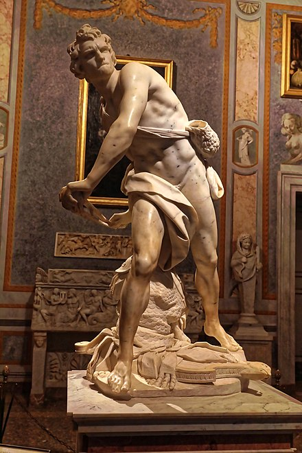
David (1623-24),
Bernini


We missed Bernini's (1598–1680) marble David while in Rome. He's on display at Galleria Borghese. We also missed Donatello's David, which I studied in my art history class. Although Bernini's is more of an action  (sling) shot. I think I prefer Donatello's bronze version.


Degas (1834–1917), although best known for painting ballet dancers and racehorses, he also sculpted them. We saw examples of them at the Ny Carlsberg Glyptotek museum while in Copenhagen, Denmark in June 2019. See my May 2020 post, entitled Sculpture - Another Dimension of Art.


The Kiss (1882),
Rodin
While in Copenhagen, we also saw Rodin (1840–1917) sculptures, though I struggle to remember any. He never actually carved any of his sculptures, instead merely directing other artisans to create them, probably due to poor eyesight. Famous for The Kiss and The Thinker, it was so realistic that he was suspected of surmoulage --  casting directly on the model's body.

More impressive is the Palm Garden and Kai Nielsen's (1882–1924) Mother of Water  (1918-20) as its centerpiece.

Unfortunately, we missed the Auguste Rodin - Displacements exhibit in 2021.


The only Brancusi (1876–1957) sculpture that speaks to me is Suffering (1907), which currently resides at the Art Institute of Chicago. It's an expressive bronze bust of a child. Unfortunately, the image is copyrighted. The Institute is on my bucket list to visit.


King and Queen (1952),
Moore


Henry Moore's (1898–1986) bronze sculpture once resided in Glenkiln Sculpture Park, located in Dumfries, Scotland. While I'd been to Edinburgh, Scotland in 2017, we didn't visit its park either. Lots of sculpture to see all over the UK! My favorite park is Vigeland Sculpture Park in Oslo, Norway, where we visited in June 2019.


Spider (1996), Bourgeois


Surrealist & Feminist artist, Louise Bourgeois (1911–2010) created this creepy Spider sculpture in 1996. I wonder if she was consulted for creating Ron Weasley's nemeses in the Harry Potter movies?

Saturday, March 23, 2024

Pumpkin Carving 2023

It's been a while since my last post. Still observing and appreciating art around me, but haven't been able to devote much time to creating art myself since late 2023, with my last works being carved jack-o-lanterns in October. I was inspired by binge watching the Star Wars television series about the Ahsoka Tano the Jedi. She is actually my second pumpkin carving of 2023.


For my first carving of the season I wanted to try out new eyes, specifically peeling concentric circles deeper and deeper from skin to flesh. It kinda turned into an owl, but it was inspired by my own version of Angry Birds.


I then tried emulating a witch face silhouetted against a harvest moon.

Not my best work!


I also did a more traditional jack-o-lantern face with sort of a batwing mouth, skeleton nose, and scary cat eyes. 

You may remember my scary cougar pumpkin, complete with whiskers.

For my final pumpkin, I found three howling wolves on a t-shirt design that as it turns out my nephew owns. While I often use black or red marker to sketch out my design, this time I used a black Sharpie to accentuate the wolves and add another value.


This technique was inspired by my niece who recreated a design found on a Halloween decoration containing a ghost with a black hat. I simply used the marker in a different way.

Monday, May 22, 2023

Indigenous Art - Animals


In this post, I will cover a small portion of Indigenous American and Canadian art. I am fascinated by the red, black and white graphical images of animals by various Indian tribes. Although I would love to attempt to produce such drawings, I respect that such art forms belong exclusively to native cultures. I love this Gitxsan (Canadian) Eagle for its symmetric composition and use of positive-negative space.


Front of Helmet
Inspired by a Seahawks football helmet, here is a jack-o-lantern that I carved one Halloween. I carved the Seahawks emblem around the sides and back of the pumpkin.

Back
Side


This Haida graphic includes a fish and the heads of an eagle and a wolf. I appreciate how the arrangement fits nicely inside a circle shape. Notice how the artist incorporates the eagle's wing, the wolf's claw, and the fish's fin and tail.


This wolf may have been drawn freehand by a high school student in an art class. I love the repetition of jagged black and red positive shapes. The negative white space fits them together (like a puzzle) to make the wolf head.


Another Halloween I found this amazing pumpkin carving of a wolf head. That year, I decided to do a Day of the Dead (Día de Muertos) skull and a raven instead.


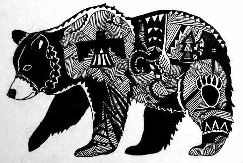
I also found animals such as buffalo and bears captured uncommonly in indigenous graphics.


This bear is done in black and white and would make a great animal art project for fifth graders. I would have my students divide their animals into shapes, then fill them in using Zentangles. I appreciate the inclusion of native symbols: eagle, bear paw, tree, and mountains.


Salmon symbolize determination and perseverance. These fish miraculously find their way in turbulent rivers to spawn upstream. Metaphorically, they help us find our way in life and reach our goals.


Aboriginal artists use repetition of dots to decorate Illuka animal designs. Here, a reddish orange, black, and white-outlined eagle is beautifully surrounded by a sky using contrasting shades of blue. The addition of hands repeats the outstretched feathers of the bird's wings.


The flute playing character Kokopelli, more human than animal, represents the fertility god of Hohokam, Yuman, and ancestral Puebloan peoples of Southwestern America. Kokopelli is basically a stick figure adorned with a feathered headdress and flute. I had created a project for third graders using Kokopelli figures, but sadly my hosting teacher passed away before I could teach the lesson. I once gifted her a book of Aesop's Fables containing animals drawn by Jacob Lawrence.


I dedicate this post to my niece's 3rd grade teacher, Geriann Holmes Marchio, who passed away in November of 2019.

Friday, January 20, 2023

Album Cover Artwork and Designers

Rock Album Covers


Sgt. Pepper's Lonely Hearts Club Band (1967), Blake


Many albums simply use words and photographs of the musicians on their covers, such as the Beatles' Abby Road from 1969 (their eleventh album). In 2017, on our trip to the UK, we visited the Beatles museum in Liverpool, England. One wall was wallpapered with a life-sized copy of the iconic cover photo with the Fab Four strutting in the crosswalk. Even more iconic is the cover for 1967's Sgt. Pepper's Lonely Hearts Club Band, the Beatles' eighth studio album, designed by British Pop Artist Peter Blake (1932-).

This post will examine cover art from a dozen 20th-century designers.


Face Dances (1981), Blake et.al.

I also love Blake's 1981 design of the "Face Dances" cover of The Who members (by row) -- Pete Townshend, Roger Daltrey, John Entwistle, and Kenney Jones -- whose portraits were painted by sixteen artists: Bill Jacklin, Tom Phillips, Colin Self, Richard Hamilton; Michael Andrews, Allen Jones, David Inshaw, David Hockney; Clive Barker, R. B. Kitaj, Howard Hodgkin, Patrick Caulfield; Peter Blake, Joe Tilson, Patrick Procktor and David Tindle. It was featured in my April 2020 post entitled, Op & Pop Artists - From Allegorical Renaissance to Modern Day Optical and Kinetic Art.
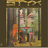


Grand Illusion (1977),
Mouse Miller

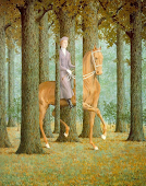
Blank Signature (1965),
Magritte


American artist Stanley "Mouse" Miller (1940-) is famous for his 1960s psychedelic rock album cover designs for the Grateful Dead, Journey, and Styx. His "Grand Illusion" Styx album is a pastiche (imitation) of Belgian Surrealist René Magritte's Blank Signature.


Felix-Wyeth

Get Happy!! (1980),
Barney Bubbles

English graphic artist Barney Bubbles (1942-1983) was born Colin Fulcher. He is called the 'founding father' of album covers. His Elvis Costello and the Attractions' "Get Happy!!" cover reminds me of the project my fifth graders did for my N.C. Wyeth movement lesson, using repetition of neon-colored shapes.


Swans Reflecting Elephants
(1937), Salvador Dali

Osibisa (1971), Roger Dean

English artist Roger Dean (1944-) designed the 1971 album for British afro rock band Osibisa. The elephant head butterflies remind me of Swans Reflecting Elephants (1937) by surrealist Dali (1904-89).


Playground Psychotics (1992), Schenkel


I like the color scheme of the Frank Zappa and The Mothers of Invention album, Playground Psychotics, which was released in 1992. Designed by Cal Schenkel (1947-), I appreciate his black-and-white drawings of band members and  Zentangle-like doodles (e.g., spirals). This is what I imagine an album cover would look like!


Powderfinger - Golden Rule (2009), Thorgerson


Storm Thorgerson (1944-2013) designed this simple cover for the seventh and final studio album, Golden Rule, by Australian rock band Powderfinger in 2009. Their 2010 album, Sail the Wildest Stretch, also sports a more vivid version of the bird on its cover. Journey also uses a bird symbol on their albums. I wonder if the Australian band chose its name after Neil Young's 1979 song, Powderfinger.


Jazz Album Covers

Tequilla Mockingbird (1979), Glaser


The 1979 Ramsey Lewis cover "Tequilla Mockingbird" was produced under the direction of Paula Scher and John Berg and illustrated by Milton Glaser (1929-2020). I like its simplicity and movement with its bright rainbow colors against a black background. The jagged lettering of the title deconstructs it into the familiar "To Kill a Mockingbird".


Basie and Williams (1956), Martin


Jazz album covers are typically very graphic and often in a red-black-and-white color scheme. The drawings were cartoon-like and usually included musical instruments. Here are covers by David Stone Martin (1913-1992) and Reid Miles (1927-1993). See the link for more of Martin's covers. I love the watercolor touches on this particular cover.


A Swingin' Affair (1963), Reid Miles


This cover for saxophonist Dexter Gordon was designed by Reid Miles. Although it has a photographic portrait of the musician, I love the composition of red against the black background. You can see more at The Album Cover Art at Blue Note Records.


Artsy Album Covers

New Order - Technique (1989), Saville


These last three covers are much more like paintings than album covers. For New Order's Technique album, Peter Saville (1955-) colorized a cherubic garden ornament complete with psychedelic colors. Apparently, it went well with the vibe of this electronic dance band's music. I imagine the cherub playing an invisible air guitar.


Atomic Playboys (1989), HR Giger


Surrealist artist HR Giger's (1940-2014) Atomic Playboys cover was created for guitarist Steve Stevens' (born Steven Bruce Schneider in 1959) first studio album. Its rather gothic design includes a guitar fret. He was Billy Idol's guitarist and songwriting collaborator, who also played for Michael Jackson, Ric Ocasek, Robert Palmer, and others.


The Bleeders (2008), Vaughan Oliver


British graphic designer Vaughan Oliver (1957-2019) produced this cover for the Bleeders in 2008. It reminds me of the works of abstract expressionists, which have been created by many of my favorite artists. It doesn't look like an album cover, but I really like its contrasting colors and white highlights!


I hope you enjoyed reading this post as much as I have researching it. Please visit the links, especially the other jazz covers. You may also wish to comment naming your favorite album cover!

Thursday, July 21, 2022

More Artist Jeopardy

Back in February of 2020, I posted Artist Jeopardy. As a follow-on challenge for both Jeopardy fans and art enthusiasts, here are four more categories to test your knowledge of famous artists. I'll start with my own Jeopardy bio-story.

I’ve been watching Jeopardy since Art Fleming hosted it prior to my high school graduation in 1975. I’ve written several of my own Jeopardy answers over the years. My first game was in 1992 in honor of my parents' 40th wedding anniversary; the answers were all about their married life and Mom won. Fun fact: Mom was a 3-day winner on Concentration (with Host Hugh Downs) when I was in the first grade.

My next game was in the late 1990s with several Art categories that I presented on behalf of the Interurban Center for the Arts in my version of their Projects, Projects class taught to prospective elementary school parent volunteer art docents. Then, in 2005 during my City University Master’s Program, I played Jeopardy Host, Alex Trebek in a version of the game devoted to the subject of Project Management. So, I’ve been part of the game for over 50 years! Maybe I should become a writer for Jeopardy!! Do they even have guest writers?

And the categories are...


WOMEN OF ABSTRACT
EXPRESSIONISM


THE ART OF BASEBALL

For the Video Daily Double


ARTIST'S MUSEUMS

(Name the City)


FATHERS OF ART

MOVEMENTS


Wednesday, January 26, 2022

Animal Portraits Revisited

I used my birthday gift to attend a 2.5-hr wood burning (pyrography) class in Bothell with my daughter. Here's the resulting portrait of our two dogs on a cutting board (a.k.a. chartcuterie). The trick to tracing both straight and curved lines is to move the tip of the tool slowly and steadily across the surface. You must get used to the wood grain interrupting the flow. Shading, as with drawing and painting, is another technique to master.


The class was hosted at Piper (boutique) in Bothell, WA with instructor Crystal Bailar. It was a relaxing class and they served wine and snacks. It afforded me the opportunity to try new techniques. We used locally sourced maple which had some beautiful grain. I almost wish that I had done a mountain landscape since the clouds would have come ready made!

My Daughter's Landscape


I probably should have traded boards with my daughter as her wood had no visible grain pattern.


Oscar, Violet, Tanner, and Chachi

My brother and I share a common interest in painting animals, landscapes, and sports figures in different media. We encourage each other by reviewing and commenting on our work and challenging ourselves to try other media and techniques. Some day I will try Paint 3D like my brother’s ~mixed-media electronic drawings. Recently, my brother completed 3 more cat portraits, adding Oscar, Violet, and Tanner to the one of Chachi from my previous post. He then used Zazzle to create a throw pillow to match his new sofa.


If you struggle with drawing, try tracing a photograph using a printout sized to your paper (stretched canvas, or even a cutting board), using carbon paper and a stylus or even a graphite pencil. The amount of detail is up to you. This method will help with proportions and for portraits get the facial features right.


It’s still fun to practice drawing, and getting past such hurdles will enable you to focus on learning to paint with a brush, a stick of chalk pastel, or a wood burning tool. There are many techniques to learn, all which require practice to master. Always try out new tools or tips on a scrap piece of wood first.


Averil by Cheryl Schmitz
As you progress your own style will emerge. The thing I’ve been working on lately is editing. I also want to be more creative about my color schemes and backgrounds. Don’t be afraid to use your imagination and expression to interpret what you see. Get inspired by studying the artwork of others. You may copy a landscape, for example, from a photograph you took with your camera or assemble your own composition from individual trees or mountain shapes.


Aya by Cheryl Schmitz


My colleague from Paws with Cause, resident artist Cheryl Schmitz, gets creative with her color schemes, making beautifully artistic renditions of these shelter animals. Also notice the editing and how well-chosen her background colors enhance the portrait.


Disney's Tramp Pumpkin

Golden Retriever Pumpkin


Collecting various examples will spark your imagination and enable you to visualize and arrange your own compositions. I challenged myself this Halloween by copying two dog portraits and actively demonstrated my pumpkin carving skills at the Everett Farmers' Market. I also found that a linoleum cutter worked really well for scraping,


When pumpkin carving, use a washable marker to sketch the line to guide your cuts. This is certainly an opportunity to edit down to the essential details. I've been experimenting with my range of values through scraping off the skin and exposing various depths. This is also where you can develop your understanding of positive and negative space. This  year I was afforded the opportunity to teach an online pumpkin carving class. I reimagined the Husky mascot from a previous year and also used scraping for the cheeks and jeweled beads for the eyes.


I want to finish with another rendition of a Bryce and Jeju portrait. While in Palm Springs last year the pair was watching me from inside a bedroom window and we captured them in a photo I used to paint a watercolor portrait. The proportions look a little off, but realize that Bryce is on the bed and Jeju is standing on the floor at the wall in the middle ground. The inside, bottom half of the picture is less-focused, in shadow, and the dogs' silhouettes appear highlighted by the sunlight streaming in the window. I like the contrast to the vivid outside landscape. I probably should have edited out the wires around the telephone pole, but then it would have read as a tree. Maybe I could have removed it altogether! See what I mean about editing?!