Sunday, September 25, 2022

Painting Using MS Paint 3D -- How To

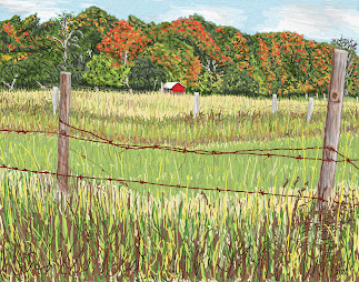
Gaylord, Michigan (2022), Jon Patterson

For a while now, I've been posting my brother's artwork that he masterfully accomplishes using Microsoft Paint 3D. It usually requires a tablet and stylus to adequately control the brush strokes using the tools. Unfortunately, the devices available to me are either PCs or Android tablets, so I will need to eventually purchase a MS Surface. Here's the latest painting by my brother. It was inspired by a Fall 2007 photograph my sister-in-law took in the northern part of the lower peninsula of Michigan. It's his third oil brush painting.


He did use the marker tool for very fine lines like the fencing in the background as the oil brush tool's smallest stroke width was too wide. He also used the watercolor brush to blend colors here and there. You'll find that it takes lots of practice to do blending with this tool.


So let's explore the modern world of digital painting! We'll start with a simpler portrait of a cat named Hopper using a photo from South County Cats that we use for PawsWithCause, the non-profit where I volunteer my time in retirement. When we sketch a shelter animal on a canvas for someone else to paint, we typically use Paint 3D to eliminate the background, isolating the animal itself. You may also use Photoshop to accomplish the same thing. This will allow you to lay down any shade you want (using the paint bucket tool) and then add details over it (sort of like underpainting).


My brother used Photoshop to make a transparent background with the cat at 40% opacity, and a second file has the cat at 100% opacity. Sometimes it's easier to color over if the subject is not so bold as 100% opacity. Hopefully at 40% opacity you can still make out the details, but you may also reference the original photo of your subject for the colors, shapes, and shading.


You'll have to overlay color to get a blended effect. But if you use the degree opacity -- which you can set for 7 of the 10 drawing tools -- you can sort of achieve a blended effect. Also, try different shades of a similar color to get the effect you want; i.e., make the overlay color have a hint of the "under" color by sliding along the rainbow color bar. I like the way the shag carpet came out in my background. Don't worry about getting every little detail purr-fect. You are allowed to edit. Since this is my first attempt, I tried nearly every type of brush (even the spray can) available with the tool.


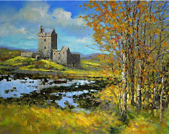
Original Photo of a Painting

Although I am still limping by with a mouse, I decided to jump right into a more complicated landscape. I chose one with lots of color and appropriately Autumn leaves. It was a photo of a painting that I supplied for inspiration during my recent Acrylic Landscapes class at Franke Tobey Jones' Senior University in Tacoma, WA. I decided to do my painting free-hand from this photo.
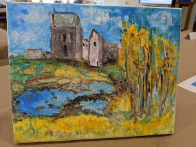


Acrylic on Canvas


And here's an interpretation done in acrylic on an 8"X10" canvas by one of my students. Note how she chose to make the castle the focus of her painting. She listened to my tips and tricks, used a modified color scheme, edited out the mountain, and created her own composition.


Let's get started with my Paint 3D version and set the size of our canvas. For an 11x14", set the height at 2200 pixels and the width at 2800 pixels. For an 8x10", set the height at 1920 pixels and the width at 2400 pixels. For a square design, it may be ~2500 x 2500 pixels. The higher the pixel number, the higher the resolution (and the bigger the file size). Since you set this in Paint 3D, for a Paint 3D PROJECT (and not an image you are importing), the numbers apply to the whole project (if that makes sense).


The first painting step is to lay down the zones of color in the background, using broad (20-50 pixel setting) brush strokes, to serve as our underpainting. My brother recommended using primarily the oil brush tool for this painting.


Mine is a bit more detailed because I wanted to leave a space for the clouds and castle shape. The trees will eventually show through to the background, so I extended the dark gray shape to the right. It may be important to write down the RGB color codes you choose in the event you want to return to them later (e.g. for the pond reflection). Of course, you can rely on your eyes for choosing colors.


Most of the rest of the painting can be done with the oil brush set for narrower strokes (25 pixels or less). Experiment! Remember you can always hit the “Undo” button if you don’t like it! The “Undo” button can erase a seemingly unlimited number of previous strokes. While I was using a mouse, I noticed that I had to lift it up regularly, so that I didn't Undo large areas. This is especially true when scribbling in the clouds!


I used the marker tool to begin playing with the trees. Since I don't have to wait for paint to dry, I am able to freely move around and add overlapping details. I did some of it with the watercolor brush and even tried the spray can tool on the shadowy grass in the foreground (in later steps).


This picture has lots of colors in it, so I chose multiple shades of yellow, orange, green, etc. And remember, when you’re in “yellow” mode, you can slide that rainbow color bar toward orange if you want it more orange, or toward green if you want it more green. This is pretty much the final state of this painting. I like how my colors are brighter than the original. I probably could have made the grassy area in the foreground more vivid, but I was mainly playing with the tools.


Here's the final painting. Notice how the sky has been softened using a combination of watercolor strokes and the spray can tool. The horizon line has also been blended. I added in grass using the marker tool to give a bit more detail to the foreground. For my next challenge, I may try painting a dog.


Here's a kitschy painting of my 1-yr-old Shih Tzu masquerading as a Star Wars Wookie, Chewbacca. I call it Chewbailey.


Here she is dressed as an organ grinder's monkey. Her paws are raised above her head as if she's putting on the fez.


After hiking the Cedar Butte Trail in North Bend, I was inspired to capture the view from the top using my PC mouse in Paint 3D. Similar to the above landscape, I laid down bands of color for the sky using the oil brush. Then I worked on the purple mountain and the lower valley. After softening/blending the sky, I used the watercolor brush and spray can to create a sort of haze. I finished by drawing in the trees using a combination of the marker and other tools.


Sunday, September 18, 2022

More Seniors' Art -- Acrylic Landscapes

My recent class at Franke Tobey Jones' Senior University was about learning to paint landscapes using acrylic paint on canvas. Acrylics is a great medium and much more forgiving than oils. The paint dries quickly and allows one to layer and easily correct mistakes. There were eleven students, some returning from my earlier sessions. As with my pastel painting class, I showed examples and shared methodologies, tips and tricks. Some students brought their own favorite photos while most selected their subject from landscape photos that I provided. 

When using a photograph as inspiration, recreate the scene for the shape (of shadows too) and lighting (value), its arrangement (composition), not (necessarily) for the colors depicted in the photo. Begin by drawing on paper or canvas using pencil, charcoal, or flair pen/markers. While students were sketching, I began instruction and limited it to <30 minutes. I allowed 90 minutes to complete a landscape painting.

Sketching

o Keep the same composition, if you really like it, or
o Edit out certain elements in favor of finding more pleasing ways to compose your painting
o Grid-up your adjusted composition lightly in pencil on your paper or canvas
o Avoid pressing too hard, especially if using a fine-tipped marker

Methodologies -- Tips & Tricks

o Choose your focal point.

      o Highest contrast should be closest to your focal point.

o Toward the end of your painting, re-establish highlights and deep shadows.

o Choose colors that create a mood for your landscape.

o Consider painting your skies in tones and hues closer to those of the foreground.
    (i.e. “Think outside the blue box”)

      o This will help mirror the elements so they complement one another.

o Use value-appropriate colors, constantly evaluating the balance of color and value

      o Far away colors get bluer and lighter as they recede, fuzzier and less detailed.


Related Concepts - Form & Space

The Gleaners (1857), Millet
While discussing the concepts of Form and Space, I used Jean-François Millet’s The Gleaners as a good landscape example (my favorite). We reviewed art elements, principles and vocabulary (foreground, middle ground, background), then discussed how artists create depth in their paintings.

Form refers to objects or shapes that are 3-D, having length, width, and height. As artists, we work to create the illusion of form in drawings and paintings.


We use Space (or the emptiness or area between, around, above, below, or within objects) to show the relationships between forms. We further create the illusion of 3-dimensionality in a 2-dimensional space by creating Depth

There are six ways to create depth in a 2-dimensional painting:
1.  Placement – Objects placed higher in the picture will seem farther away
    a. The Rule of Thirds is a guideline that helps the artist with the placement of elements and the focal point within the composition.
2. Overlapping – Obscuring farther away objects with closer objects that overlap and using contrasting values
3.  Size – Far away objects appear smaller less distinct
4.  Detail – Far away objects should have less detail
5. Color or Value – Cooler colors or objects Lighter in Value will also appear farther away
6.  Perspective – The illusion of objects moving away via lines that converge to an infinite point.


I showed examples of my own acrylic paintings (and some from PawsWithCause paint parties). I gave a slideshow of the progression of my painting of Bo the homeless shelter dog. We also discussed color choices, value distribution, detail, establishing a center of interest, creating a sense of perspective, vibration of colors using opposite colors, and under painting.


Mountain Reflection by Linda

Paintings by My Seniors


So, now I'd like to share some of the paintings created by the seniors who took my class. The first landscape was created by my quilter, Linda. She chose to paint this beautiful mountain reflection. She told me that she was going to give her painting to her son.


Mary's Autumn Sunset
Next we have Mary's autumn sunset painting. I like this one for its limited color palette. Mary spent a lot of her time perfecting the turbulent looking water. I recommended that everyone take a photo on their phones as a way of looking at their masterpiece through different eyes. Somehow, your brain is more forgiving and less judgmental when seeing your artwork as a photo rather than a canvas that you've been staring at for hours. Like paintings in an art museum setting it is good to view them from close up and far away.


Kelly's Pastoral Landscape
Owl in a Tree
The next two paintings surprised me. The first student painted a large autumn tree, then at the last minute added an owl perched in her tree. The second painting is a pastoral landscape that turned out looking like a watercolor. Kelly is a returning student who listened well to my instruction for placing highlights on eyes in a portrait, using the wooden end of the brush. Here, she used this dotting technique to simulate rows of crops in her wavy field.
I told her that it reminded me of the landscapes of Port Townsend artist, Don Tiller.


John's Lighthouse Landscape


Speaking of Port Townsend, here is John's painting of the Point Wilson Lighthouse. John brought his own picture for inspiration. He successfully captured those classic windswept trees that remind me of an African savannah. I love the texture of the grey sky and drybrush technique.


Ocean Cottage
I call the next landscape, Ocean Cottage. It is very impressionistic in its brushstrokes that lay down broad areas of color suggesting a turbulent sky and rushing waves. This also reminds me of a watercolor painting. My student was frustrated with her image of the cottage and wanted to paint over it. Thankfully, I was able to talk her out of it. I love its simplicity and the movement she was able to create.

On a larger scale this painting would make a great image to hang in someone's living room or dining room.


Castle Pond Landscape
Finally, this last landscape is just as playful as the image of the painting that inspired it. It reminds me of how Vincent Van Gogh would 'copy' the works of Jean-François Millet and make them his own. While recognizably similar, once again I am getting a Monet-like impression with a watercolor feel. One of the hardest things to teach students is how to get the right mix of paint and water. It's mostly about the flow of the paint and the opacity or translucence you're trying to achieve. Mastering this medium takes lots of practice and experimentation.


For my own next painting challenge, I am going to teach myself how to paint using Paint 3D on my new tablet with the help of my brother. My first effort will be to paint the above castle pond landscape. My brother will outline some steps for me as I learn to use this (new to me) computer tool, initially using the mouse on my PC. Eventually, I will purchase a Microsoft Surface and stylus to make it easier on me. I plan to take pictures as I progress.. In between, I may post other examples of the masterpieces my brother has created using the tool. Stay tuned!

Sunday, September 4, 2022

Artists Born Under Virgo or Libra

Chrysanthemums (1874-6), Tissot

To start posting for the month of September let's look at artists born under the Zodiac signs of Virgo (Aug 23rd thru Sept 22nd) and Libra (Sept 23rd thru Oct 23rd). Virgo artists are hardworking, intelligent, and adventurous, having traits including rational thinking, problem-solving, and an adventurous spirit. Libras, unlike other introverted, unsociable artists, are social butterflies who are outgoing and charming. Libras also have great taste in art and fashion.

French artist, James Tissot (1836-1902), born (in October) under the sign of Libra, painted Chrysanthemums, shown here as the floral symbol for the sign Virgo. Tissot was a friend and mentor of Edgar Degas.


VIRGOS

Thunderstorm (1948), Grandma Moses

One of the most famous American artists born (September 7th) under Virgo is Grandma Moses (1860-1961). She appears in my January 2021 post entitled, Master Artists -- Inspired Late Bloomers and Resilient, Active Seniors. She turned to painting when arthritis kept her from doing her elaborate needlework, but she kept her 'primitive' style. Teachers may use her work as an inspiration for a lesson about the elements of a landscape for younger children. Older children will need to learn the principles of perspective and proportion, not present in her work, for learning about space.


Constellations (1938), Hans Arp


German-French Sculptor, painter, poet, Jeans Hans Arp (1886-1966) was born September 15th. His Constellations linoleum cut is reminiscent of the biomorphic shapes used by (Capricorn) Henri Matisse. Years ago when I taught my daughter in her 6th-grade classroom, my students traced a Matisse shape and were asked to design a composition around it.


Mecklenburg Autumn (1979), Bearden


American artist Romare Bearden (1911-1988), born September 2nd, is famous for collages using photographs and painted paper in a style derived from Cubism. His work also depicts American black culture like his colleague, Jacob Lawrence. Another great artist for studying the art of collage would be American painter, (Libra) Robert Rauschenberg. I use collage for doing wrapping paper self-portraits, which could also be inspired by portrait artists: Amedeo Modigliani, Gilbert Stuart and Sir Joshua Reynolds.


The Migration Series (1941),
Jacob Lawrence
Felix (inspired by N.C. Wyeth)

In 2017 I visited the Seattle Art Museum and saw the exhibit, Jacob Lawrence: The Migration Series. Born September 7th, 1917, his work chronicled the migration of African Americans from the rural South to the industrious North in the decades following World War I.

Here's a project inspired by N.C. Wyeth that was designed to demonstrate the concept of movement. It would also work for a lesson about Jacob Lawrence. The challenge is cutting out the figures, so this lesson works best with 5th- or 6th-graders.


LIBRAS

Medusa (1597), Caravaggio


My first Libra artist is the controversial Italian painter, Caravaggio (1573-1610), born September 28th. He appeared in my March 2020 post entitled, Artist Frenemies - Friendships, Rivalries, and Competition, about his feud with artist Giovanni. Libras are supposedly non-confrontational although I imagine that Caravaggio exhibited the extremely emotional side of the sign. I've seen his artwork in several museums, but it may be somewhat inappropriate for younger viewers.


The Raft of Medusa (1819), Géricault 

This next artist is French painter and lithographer, Théodore Géricault (1791-1824), born September 26th. His epic masterpiece, The Raft of Medusa (1819), is often compared to Delacroix's Liberty Leading the People (1839). Both are good examples of Romanticism, a movement characterized by intense emotion. A young Delacroix (Taurus) actually posed as one of the dying figures on the raft!


No. 1 (Royal Red and Blue)
(1954), Mark Rothko

Libra Mark Rothko (1903-1970), was an American artist, born September 25th, who was famous for his abstract color field paintings designed to evoke emotion from viewers. While initially studying Architecture in college we did many color studies in order to explore color combinations and the optical effect of placing them adjacent to each other. Another Libra artist whose work I don't claim to understand is Robert Rauschenberg. His three-panel White Painting (1951) is particularly unusual and rather uninspiring!

I focus a lot on art history and researching various artists to add interest to my art lessons. And it's important to find inspiration when creating art! I hope this group of artists inspires you to create your own artwork or delve deeper into learning about these artists and their art movements and styles.