Showing posts with label Landscapes. Show all posts

Friday, July 14, 2023

Tips for Creating Landscapes

Photo of the View from the top of Cedar Butte


When painting landscapes, I like to use a reference photo as a guide to help capture atmospheric and realistic detail. You may also find inspiration by painting outdoors (en plen air). Here's a photo I took at the top of Cedar Butte. See my September 2022 post, Painting Using MS Paint 3D -- How To.


My Paint 3D Landscape


I painted the background first, then added foreground elements such as bushes and trees later. For oils and acrylics, you may choose to lay down a darker color for the background and work up in value for the addition of clouds. For pastels, simply start with paper that is already a neutral (not white) color.


Use color temperature to create the illusion of depth. Add opposite colors to either cool down the color of mountains in the background or warm up the trees in the foreground. I chose to lay down bands of color in my background then framed the sky with an outline of the mountains. I chose a cooler purple for my mountains and gradually got warmer toward the foreground. My painting is brighter than the photo. Adding the trees over the background in contrasting dark green (instead of black) continued to elevate the overall temperature.

Bob Ross painting with a cabin


Create a focal point in your in the composition. This can be a barn or small outbuilding (palette knife comes in handy for the texture), or even a large, interesting tree. You may choose to make the barn stand out by using sharp contrast in colors or values and shading for more emphasis. This painting by Bob Ross would be fun to try in pastels.


Another Bob Ross painting using a palette knife
and a two-inch brush

Use the palette knife to add texture and crisp edges, Bob Ross used the edge of his knife to create water lines next to the shoreline and ripples in the water. It also helps create texture on snowy mountains. A large dry brush pulls down paint for the reflection. Then light, side-to-side strokes soften and blend for the illusion of water. His use of temperature in the rainbow-colored sky almost makes his composition like two different paintings.


Jeu and Bryce at Lake Sawyer
(2022), Patterson


Simplify the clutter (edit out unwanted details). Give the illusion of numbers, but don't try to paint every individual tree you see. Map out the overall shapes for the grouping of trees, then add just a few details. This is something that Impressionists like Monet mastered in suggesting a forest or line of trees.


Mary's Creepy Landscape


Try using a limited palette of colors and subtle variations between them. Use brighter, more saturated colors and more delicate brushwork for the focal point (compared to the rest of the painting). This one was done by one of my students at Franke Tobey Jones' Senior University. I'm guessing that the bright moon is the focal point. My favorite part is the turbulent water.


Beach in Pourville (1882), Monet


Embrace imperfection. You don't have to be completely accurate with values, colors, and structure as you would in a still-life or portrait. Impressionists like Claude Monet loved to paint beach scenes, often void of human figures, to create a mood and a soft composition of color. The only real value or shading comes in the cliffs framing the bottom right corner.


Landscape at Collioure (1905), Matisse


Employ timed sketches to improve your judgment. Practice painting on smaller canvases using quick sketches and limiting the time it takes to complete your painting. Famous artists used studies to plan the placement of elements, color scheme, and composition. It may also help you to decide when your painting is finished.


Grand Canyon of the Yellowstone (1872),
Thomas Moran


Let's finish with this spectacular landscape of the Grand Canyon of the Yellowstone by Thomas Moran. I love the contrast between the foreground and sunlit canyon. He painted several versions of the canyon, capturing the scenic view in all four seasons.


My brothers and their wives visited Yellowstone recently while attending my daughter's wedding in Montana. Two trees frame the view of the watery focal point in this photograph by my sister-in-law.

Wednesday, May 31, 2023

My Life as a Struggling Artist and Volunteer

Manet +/- Space Project, Lowell Elementary
I've been encouraged all my life to create art. While I am not as prolific as other artists, I do try to share what I've learned about art with others; and that has been one of my goals in retirement. Early on, my focus was volunteering in elementary schools, but that ended with the pandemic. I am now much more challenged to find outlets for my creativity.

Bo the Dog, PwC


Probably my most successful retirement endeavor has been volunteering with PawsWithCause. The non-profit organization allowed me to continue teaching others how to do art at paint parties, to employ salesmanship in raising money for a cause, show artwork of others, build community, and do custom pet portraits upon request.


Kandinsky Circles, Old Friends Club

I have been successful at teaching seniors in multiple locations, including assisted living communities, adult memory daycares, senior centers, and a senior university (in Tacoma). I've also taught online classes a few times. I don't understand why it takes so much effort to volunteer my services. Even with websites like VolunteerMatch, it is difficult to get pro-bono work that doesn't limit my own creativity or require me to use my own supplies.


My Degas Demo, FTJ Pastels Class


I've been happy teaching at Franke Tobey Jones' Senior University in Tacoma, where I get a stipend and get paid, but that's only twice a year, if I'm lucky. My students are a willing and captive audience. It surprises me that senior centers are less interested in doing art and favor playing Bingo. Assisted Living communities should also welcome someone to conduct art activities, but they have their own staff and such limited budgets. I wonder if I could apply for a grant to bring my own prepaid art supplies to senior communities.


Castle Landscape in Paint3D

So, here I sit in my office blogging about past experiences. I occasionally paint portraits or landscapes in my spare time. My brother helped encourage me to learn Paint3D and I've done several awesome paintings on my PC using a mouse. I've even tried homeschooling 'grandkids' and got paid to bring art lessons to a nearby summer camp. Both gigs challenged me to adapt my lesson plans for students ranging in age from 4-13 years old.


Palm Tree, Circle of Love Class


What all of this 'struggle' is meant to convey is that sometimes creativity is required in order to successfully dedicate oneself to volunteering. I guess I thought that it would get easier over time, and that with blogging and posting on Facebook more people would be asking me to teach classes and volunteer.


City Dog Park, Palm Springs, CA
Bryce and Friends, Redding, CA

Over the past few years, I've used our trips to Palm Springs as an opportunity to paint, do animal portraits of dogs from the local dog park, and develop lesson plans and project demos.


Retirement may not mean that you will stop working. Instead, you may find creative ways of playing and exploring your newfound independence with a spirit of adventure. Living a creative life means to focus on curiosity rather than a fear of failure. Imagination, innovation, and persistence are the energies that also help us solve problems. While I've experienced some disappointment along the way, I've enjoyed the process and haven't given up. As American Christian author and speaker Joyce Meyer once said, "Patience is not the ability to wait but the ability to keep a good attitude while waiting". 

Tuesday, May 9, 2023

Reflections in Art

Landscapes


Reflections (1983), Bob Ross
I found this great article about Landscape Composition: 16 Reflections. Whether it is Sisley, Turner, or Monet painting the landscape, the result is always more pleasant and serene with the addition of a reflection in water to reveal atmospheric conditions. I particularly enjoyed watching Bob Ross' TV series The Joy of Painting, especially when he'd show us how to paint water and reflections. He pulled down color using a large dry brush, then lightly dragged his brush across to soften the reflections.


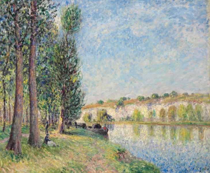
Le Loing à Moret (1885), Sisley


Impressionist painter, Alfred Sisley (1839-1899), was born to British parents in France, where he spent most of his life. His landscapes may have been inspired by the paintings of J. M. W. Turner and John Constable. I much prefer this softer work to some of his other more intricate landscapes.


Boats (1885), Sisley


While this landscape by Sisley may make a wonderful jigsaw puzzle, it makes for a very complex painting. His reflections seem to be concentrated toward the bottom, focusing on the subject boats. The clouds reflect in the water in the middle of the composition. The jetty seems to divide the painting in two.


The Studio Boat (1874), Monet

Some say that Sisley's career was overshadowed by that of Franch Impressionist Claude Monet. Monet's Studio Boat became the subject of four of his paintings. The reflections are well done. Monet has also balanced his composition by offsetting the dark boat hull with the large bank of brown autumn trees and highlighting the studio structure. Many of Monet's other works use dark purple in place of black.


The Grand Canal of Venice (1875), Manet


In Édouard Manet's Blue Venice or The Grand Canal of Venice (1875) the reflections are suggested using impressionistic brushstrokes. Like Monet's work above, Manet has atypically used black for his gondola. Everything else in the painting is bright and textured. 


Le Bateau (1953), Matisse


In 1961, Henri Matisse's Le Bateau ("The Boat") was hung upside-down at New York's Museum of Modern Art for 47 days until a patron pointed it out to a museum guard. In this simple papercut and gouache work, it was apparently difficult to distinguish between the sailboat and its reflection.


Starry Night Over the Rhône (1888), Van Gogh


Before Vincent Van Gogh painted his famous Starry Night with the swirling sky and cypress trees, he captured a moment of calm in Starry Night Over the Rhône (1888). I love the reflected lights of the city. The couple in the foreground seem to be standing in the water due to the repetition of the brushstrokes, colors, and subtle transition from water to shore.


Valley of the Yosemite (1864), Bierstadt

German-born American artist, Albert Bierstadt, painted this landscape of the Yosemite Valley in California along the Merced River in 1864. Everything about this masterpiece is amazing! I love the colors of the sky, the brightness of the sunlight reflecting off the mountains, the sliver of reflected trees in the water, and the silhouettes of the deer grazing in the foreground.


Portraits

Triple Self-Portrait
(1960), Rockwell


Some artists used mirrors in their portraits. One of the most recognizable is Norman Rockwell's self-portrait with him seated in front of a mirror and a large canvas capturing his own image three times. I enjoy seeing what he has pinned to his easel, including his own sketches on one side opposite self-portraits of fellow artists: Durer, Rembrandt, Picasso and Van Gogh. Possibly as a nod to Rembrandt, he has collected a golden helmet as a souvenir of a trip to Paris.


 'Self Portrait', from Behind Gala,
Reflected in Mirror
(1972), Dali
In 1972, Salvador Dali painted a double portrait of the artist and his muse (wife Gala). It reminds me of an interior, painted by Johannes Vermeer, with light streaming in from a window. It may also be a nod to Diego Velázquez's 1656 masterpiece of Las Meninas, where the King and Queen were subtly reflected in a mirror.

Here, we get to see both figures from the front reflected in a mirror and from the back seated. If only we could see what's on his easel! Notice how Gala's chair is downplayed in both color and value so as not to compete with the artist's chair and mirror frame.


A Bar at the Folies-Bergère (1882), Manet
Some say that the man in the upper right of the mirror is Édouard Manet himself in A Bar at the Folies-Bergère (1882). Artists often hide their self-portraits in their paintings. You don't see the back of the man at the bar because he is perhaps (Manet) the viewer of the bar scene. 

The horizontal blueish band may be the stage. The reflection of the bar itself runs behind the barmaid's hips and may be reflecting the two bottles from the lower left corner.


Girl at Mirror (1954), Norman Rockwell


Finally, here's another painting by Norman Rockwell celebrating the innocence of a young girl checking herself out in an attic mirror while reading a glamour magazine. The girl reminds me of actress Margaret O'Brien who starred opposite Judy Garland in the classic Meet Me in St. Louis ten years earlier.

Friday, March 10, 2023

Recent Artwork -- Acrylics & Watercolors

J.P. at Bat (2023), Patterson


While vacationing in Palm Springs this year I completed two more paintings, one acrylic and one watercolor. The first is a portrait of Mariner shortstop, J.P. Crawford, last season's leadoff hitter for the Seattle-based baseball club. It was so well-received on Facebook that one of our long-time friends wants to buy it for her avid baseball fan husband.

During one of the ALCS playoff games, I captured an image from the TV, then painted it using acrylics. The forearm tattoo was challenging, and I am very pleased with how well the background fans turned out.


Benny and Moana (2023), Patterson
My friend from the Palm Springs City Dog Park commissioned me to do a portrait of his two dogs, Benny and Moana. I had planned to get a large canvas and use acrylics, but instead I decided to use 11"X15" watercolor paper and watercolors. My style has always been to build up layers of paint rather than using washes. I ended up gifting the portrait (unframed) to my fellow dog park patron. Per my research it was going to cost him ~$50 to purchase a matted frame, and I left it up to him to find one that he liked.


Chihuahua (unknown)


In the Airbnb where we stayed there was a large portrait of a dog hanging in one of the bedrooms. The artist chose to use bright, non-traditional colors for this abstracted version of a chihuahua. Someday I will try my hand at alternative color schemes.


Jeju & Bryce (2022), Patterson

I did try woodburning last year in my portrait of Jeju & Bryce. Shading is accomplished by using different sized tips and varying both the pressure and length of time on the wood surface. Hopefully, I didn't ruin the tip by dragging it along the surface. Most of the class chose to do mountain landscapes with black silhouetted evergreen trees. I suppose those scenes made for more useful charcutier boards!


Sketch + Dogs
Lake Sawyer Dogs
(2022), Patterson


You may remember my other portrait of our pets captured in this beautiful Lake Sawyer landscape from last February. I began the portrait in a Zoom class put on last year by PawsWithCause as a training for its volunteers. I was inspired by late TV painter, Bob Ross and his happy little bushes and trees.


Lilly (April 2022), Patterson


In April of last year, I painted a portrait of Lilly, a greyhound mix from a local animal shelter in Kirkland, Washington. My niece loved it enough to purchase it as a donation to PawsWithCause. She planned to display it on her desk at her office. I love the glassiness of her eyes and all the colors of her fur. The muted primary colors of the collar and background also work well in the composition.


Puzzles for PawsWithCause


I used a laminated print of the portrait in a puzzle I made for kids attending one of our farmers markets.


Lakeside Castle (2022), Patterson


Inspired by a landscape by one of the students who attended my September 2022 acrylics class at Franke Tobey Jones' Senior University, here's my very first attempt at using Paint3D on my desktop PC. It was particularly challenging to use a mouse on a PC instead of a stylus on a tablet.


View from Cedar Butte (2022), Patterson


Then, in October of last year, I recreated this painting of the view from Cedar Butte trail using Paint3D. Eventually, I will purchase a tablet and stylus, and try my hand as portraits instead of the less precise use of a mouse.

Saturday, December 24, 2022

The Art of Illustration -- Rockwell, Wyeth, and Others

Daybreak (1922), Maxfield Parrish

This is a continuation of my April 2020 post entitled, Illustration in Children's Literature & the Wyeths. It is inspired by my last post Blue Morning by George Wesley Bellows that is currently on exhibit in the National Gallery of Art in Washington D.C. While investigating similar paintings framed by columns, I found Daybreak (1922) by American Illustrator Maxfield Parrish (1870-1966). 


Baseball Scene of Batter, Catcher and Umpire
(1915), Joseph Christian Leyendecker


Parrish is among the most famous American painters and was once the highest paid illustrator in the country. You've no doubt heard of Norman Rockwell (1894-1978) and maybe J.C. Leyendecker (1874-1951), both known for their covers on The Saturday Evening Post. Both were featured in my December 2020 post, Saint Nicholas and Father Christmas in Art. J.C.'s baseball illustrations may inspire me to write another post about the art of baseball!


Tough Call (1948), Norman Rockwell


Rockwell is probably the most recognizable illustrator of his time. As one of his iconic baseball illustrations depicts, it's a Tough Call as to which artist captured the spirit of baseball better -- Rockwell or Leyendecker. It was fun visiting the Baseball HOF in Cooperstown, NY in 2019 and seeing the art up close and personal. I also like Rockwell's The Dugout (1948) and Leyendecker's Boys Playing Baseball (1915).


Blue Lock the Queen (1916), N.C. Wyeth
A great place to view the works of these artists is the National Museum of American Illustration in Newport, Rhode Island. Here's a link to the N.C. Wyeth exhibit at NMAI. Wyeth (1882-1945) was one of the most famous and successful literary illustrators, helping readers visualize heroic characters in adventure books such as Treasure Island. His first cover for the Saturday Evening Post was published in 1903. I was introduced to his work while I was an art docent in my daughter's elementary school. This illustration accompanied a story published in Collier's magazine.


Mermaid (1910), Howard Pyle


Wyeth's mentor was American painter, Howard Pyle (1853-1911). His Mermaid painting is quite impressive and acclaimed for being the best depiction of a mermaid by an artist. The man being saved by the sea nymph is all blue, as if he became frozen in the frigid water, all expect for his red cap! Its movement reminds me of Wyeth's 'Blue Lock', even down to the red detail on the horse rider's head (bandana). While there is already tension in the mermaid's struggle, the red cap draws my attention even more. Also interesting is Pyle's treatment of the sea foam, reminding me of how Bob Ross teaches us to paint watery seascapes in his Joy of Painting TV series.


Battle at Sea (1947), Fischer


A student of Pyle, German-born American artist, Anton Otto Fischer (1882-1962) was also featured in the Post magazine. His illustrations often depicted maritime or marine war scenes such as Battle at Sea, published in a book about his sailing days. Curiously, there is a red flame in the center of the top third of the composition, much like the red cap in Pyle's Mermaid painting. While Pyle's seascape could be used to show movement, Fischer's would be perfect for teaching about perspective.


Violin Studies, Wistehuff


Revere Wistehuff (1900-1971) was part of the New Rochelle Art Colony in the 1920's, '30s and '40s, along with colleagues Rockwell and Leyendecker. His Violin Studies shows a boy who would rather be playing baseball than practicing his music. The kid reminds me of Buffalo Bob Smith's Howdy Doody character!


Grandma Catches Fly-ball,
Richard Sargent


Finally, we have another baseball illustration entitled, Marmont Hill Grandma Catches Fly-ball by Richard Sargent (1911-1979). It reminds me of Rockwell's The Dugout. It's surprising that she could see the ball with her eyes closed and her handbag hanging in the way. Isn't that Superman's Lois Lane standing next to her?

Thursday, November 24, 2022

Famous Artists & Paintings -- By Century

The Arnolfini Portrait (1434), van Eyck
15th Century

In this article, I'd like to review famous artists and their paintings, starting with the 15th century, highlighting my favorites. Earlier art primarily focused on religious subjects which, though ornately detailed, was pretty homogenous. Let's start with a work by Jan van Eyck, whose Arnolfini Portrait was included in my Avatars, Doppelgangers, and Lookalikes post. One of the most recognizable paintings of the 15th century, this double portrait also captures the couple's reflection in the convex mirror hung in the background. I saw it in person at the National Gallery of London in 2017. Van Eyck was considered an innovator, some saying that he created oil painting.


"Salvator Mundi" (1500), da Vinci


16th Century


At the beginning of the 16th century, Leonardo da Vinci painted this classic portrait that eventually sold for $450.3M. It was supposed to be on display at the Louvre Abu Dhabi in 2018, but it has yet to be seen in public. See my June 2020 post, entitled Encouraging Artistic Expression, for more details. His other more famous portrait, Mona Lisa, was painted during the same period. I saw her at the Louvre in Paris in 2011. His Madonna Litta was painted toward the end of the 15th century, residing at the Hermitage in St. Petersburg, Russia, where I visited in 2019.


The Hunters in the Snow (1565),
Pieter Bruegel the Elder


Later in the 16th century, Flemish painter Pieter Bruegel the Elder created The Hunters in the Snow. A large print of the landscape hung in my father's office at Price Waterhouse in NYC. It has always been one of my favorites! I love the cool teal color of the sky and frozen river. It's also a wonderful example of the use of perspective to create depth and the illusion of space.


The Saviour of the World
(1608-14), El Greco


17th Century


Moving to the early 17th century, we see El Greco's version of the Christ. The blessing gesture is similar to that of da Vinci's portrait, including the hand on the orb representing the world, although the color scheme is much more modern. I like the use of contrast, especially accentuating the face and the halo effect.


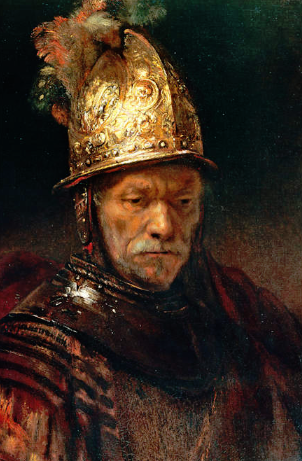
The Man in the Golden Helmet
(1650), Rembrandt


The mid-17th century paintings that I've chosen are three of my all-time favorite portraits. I do seem to gravitate towards portraits. Rembrandt is famous for having painted the most self-portraits though I love The Man in the Golden Helmet. It also inspired my work nickname 'Gelmet' which my co-workers gave me because of my gel hairdo. I often found people staring at the top of my head, much like how museum patrons might focus on the helmet in this painting.


Las Meninas (1656), Velázquez


There's something about this amazing family portrait by Diego Velázquez. To find out more, see my August 2020 post entitled Things That Go Together in Art – Subjects, Portraits, Landscapes/Seascapes, Still Lifes, and Couples. It does appear to have all the detail in the lower half of the painting, but it seems to work!


Girl with a Paearl Earring
(1665), Vermeer


This classic by Johannes Vermeer is known as the 'Mona Lisa of the North' probably because of her mysterious identity. Vermeer often employed blue and yellow in his detailed portraits, usually of women.


The Blue Boy (1770), Gainsborough

18th Century


Thomas Gainsborough and Sir Joshua Reynolds were rivals for the position of Painter to the King. On our trip to the UK in 2017, their paintings were curiously hanging side-by-side in one of the national galleries. Growing up in New Jersey, my next-door neighbor had a red sitting room where a copy of Gainsborough's Blue Boy was hung. One of the houses we rented in Port Townsend's Fort Warden had needlepoint versions of Blue Boy and Pinkie (by Thomas Lawrence) hanging side-by-side. The pair, often seen together, also appears in episodes of Leave it to Beaver just inside the Cleavers' front door entry.


The Age of Innocence (1788), Reynolds


I use portraits from Sir Joshua Reynolds and Gilbert Stuart when I do my wrapping paper self-portraits project with fifth graders. Included in one of the packets provided by Interurban Center for the Arts was his portrait of Lady Caroline (1778). The girl in this painting is unknown but is likely Reynolds' great niece.


Athenaeum Portrait
(1796), Stuart


It's unusual to find unfinished paintings on display in galleries and I've only ever seen one of them. I find it interesting that Gilbert Stuart intentionally kept one of his first portraits of George Washington unfinished to use as a model for later works. Martha Washington admired it, but Stuart refused her and painted another one instead.


Cenotaph to the Memory
of Sir Joshua Reynolds
(1833-6), Constable


19th Century


Another painting I saw at the National Gallery in London is John Constable's homage to Sir Joshua Reynolds. I enjoy seeing artwork in person, especially when it's something I've studied in school or researched for my blog or one of my classes. The stag is meant to represent the wild locale of the monument, which in actuality would have been smaller than a full-sized deer. It's up to the artist to create the focal point and provide it the proper emphasis.


Tiger in a Tropical Storm (1891), Rousseau


Here's another diamond in the rough from the National Gallery in London. It's a landscape by Henri Rousseau that could be perceived as a portrait of a tiger. Crouching tiger but no hidden dragon!


Les Oliviers (1889), Van Gogh
Of course, my all-time favorite artist has to be Vincent Van Gogh. It's difficult for me to choose a favorite. While doing research for this blog I continue to discover new (to me) Van Gogh paintings. For example, I saw this one at the Scottish National Gallery in Edinburgh. Like Van Gogh's Sunflowers, olive trees were another of his favorite subjects to paint.


I love the paintings of the French Impressionists, but there are too many for me to down select for this blog post. I also love the paintings of Henri Matisse and Marc Chagall. I highly recommend visiting their museums in Nice, France.

Capri Girl (1878), Sargent


Let's finish with the 19th century artists/paintings by including John Singer Sargent's portrait of Capri Girl. My daughter and I saw this work while briefly on exhibit at the Seattle Art Museum and we immediately fell in love with it. She appears to be leaning against the branch of a tree and gracefully becomes part of nature. Her bodice and hair blend into the dark background and her skirt disappears into the flowery field. She was a favorite subject of the artist.


Christina's World (1948), Andrew Wyeth
20th Century

My favorite artists of the 20th century are Salvador Dali, Pablo Picasso, Edward Hopper, Jacob Lawrence, Norman Rockwell, and Andrew Wyeth. Since we're primarily showcasing portraits here, and as a transition from Sargent's Capri Girl, I'm including Christina's World by Andrew Wyeth. His wife Betsy modeled for the painting inspired by the Olson (~30-yr-old) girl he saw crawling in the field.


President Obama (2018), Wiley


Kehinde Wiley is probably the best known African American portrait painter of the 21st century, although Simmie Knox was the first to paint the portrait of a President (Bill Clinton). I had the opportunity to see Wiley's paintings on exhibit at the Seattle Art Museum. I also got to see Jacob Lawrence's Migration Series, which was impressive but on a smaller scale than the large decorative works of Wiley. His intricate backgrounds are beautiful! While Lawrence used colorful shapes to build his symbolic compositions, Wiley used colorful patterns to surround and highlight his subjects.


So, who are your favorite artists? Your favorite painting? I find that I often choose to listen to the B-side of a record, straying from the more popular featured song. I also enjoy hearing the more obscure and less played selections (e.g., of Tom Petty songs) just as much as seeing newly discovered works by my favorite visual artists. As with music, you learn to love and appreciate many genres, though you will likely gravitate towards your favorites.