 Perhaps you’ve landscaped your yard, dabbled in interior decorating, or put together an outfit to wear for a special occasion. Your own sense of style or eye for what looks good is either a natural ability you have or something you learned through trial and error. Maybe you thoughtfully designed a plan to realize your vision. Even if you haven’t created the elements yourself, you’ve put them together into a composition that you (and maybe others) can appreciate. Such forms of expression qualify as art.
 |
| "Salvator Mundi" (1500), da Vinci |
The thing about art is that it is personal; a personal expression for the artist and personal experience for the viewer. If we like it enough and the artist is willing to part with it then it may be sold. The Most Expensive Painting Ever Sold is Leonardo da Vinci's painting for $450.3 Million. Impressive how much someone will pay to own art! More impressive when it is donated so that others may appreciate it!! Art is meant to be felt, interpreted, enjoyed, cherished, etc. but never judged. Art should be encouraged without fear of judgment.
 |
| Zentangle by Jane Marbaix |
Drawing and painting are merely mediums and vehicles for expressing yourself artistically. Please don’t write off doing art because of fear. Pick up a pencil or pen and doodle, practice drawing something, make a birthday card for a friend, or take a painting class with a friend or family member. Until a friend gifted me this book of 'Zentanlges' I never knew there was organized doodling. Activities like these will stimulate your brain and you may learn something in the process – the process of creating art, that is!
It's satisfying to take an idea or concept and create something. For me, it’s not so much the finished product as it is having engaged in a process of trying something new, and playing with new techniques or the arrangement of elements to my own satisfaction. I’m not into erasing or trashing what I've created. It’s okay to start over or modify the process after making it through at least once.
 |
| Magdalena Dabrowski, 1995 |
 |
| German model Helga Testorf, Wyeth |
Even famous or dedicated ‘artists’ fail and go back to the drawing board; such repetition is referred to as studies. Many artists, like Andrew Wyeth, repeated the same subject over and over, while some artists, Wassily Kandinsky and Jackson Pollock, numbered compositions. It’s similar to writing.
 |
| Paper Icebergs - Texture |

With writing, there may be lots of crumpled up paper on the ground or overflowing the wastebasket. Still, in the editing process, we learn something with each new draft.
When I'm writing my blog, I keep a running list of ideas I may want to share with my readers. Ideas may be inspired by something I've seen, places I've been, or something I want to learn more about. I've shared my observations and experiences, activities, and art from family, friends, local artists, and well-known recognizable master artists. I've discussed art from my own lesson plans and classroom teaching sessions. Whenever possible, I try to include photos of art I've seen in my travels around the world. When I encounter something interesting and relevant on the Internet, I try to include a link so that you may delve deeper into the topic or the story behind the art.
Besides the elements of line and shading that contribute to drawing, one of the more difficult areas to grasp is composition. Balance is one of the most important elements because it contributes to either a sense of calm (symmetry) or what feels right or a more dynamic feeling of unease (asymmetry). The other elements of composition are contrast, focus (emphasis), movement, pattern, rhythm, unity, and proportion. Finding the focus (directing the eye) and the right combination of contrast between light and dark, color, shape, size, texture, and type of line will determine the overall feel of your painting.
Pattern and Rhythm go hand-in-hand, like a piece of music with an underlying beat sets the auditory pace, repetition of shape and color can visually lead your eye. Unity and Proportion determine whether objects belong or fit together. These are particularly important when drawing a face.
Layout, the arrangement of an odd number of objects, and the use of negative space help create a gentle and pleasing flow (see Compositional Tricks and Tips). Movement is achieved through a combination of elements such as the contrast of texture or warm/cool colors, use of directional brushwork, or rhythmic repetition.
 |
| Marcel Duchamp (1912) |
 |
| Credit Fight Sports, John Lindsay |
Years ago, my brother created a futuristic painting (not shown) of the first of a trilogy of Ali-Frazier fights from March 1971 inspired by Marcel Duchamp's Nude Descending a Staircase (No. 2) showing movement.
 |
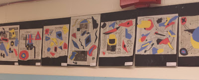
| My Kandinsky Project with Seniors |
Two of my favorite artists who are masters of composition are Kandinsky and Joan Miró. They have inspired my art projects that were successful at teaching the principle and its elements.


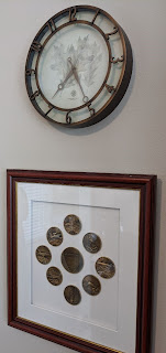
Our own home decor uses repetition of concentric circles in our carpet runners, circular patterns in a shower curtain and bath towel trim, and the medallions in a framed plaque, commemorating the programs I worked on during my career as a software engineer, and a clock that hangs in my office. While the objects were purchased individually, their usage and placement complement the rest of the decor.
 |
| "Bat, Deer and Pine" |
 |
| "Plum Blossoms, Crane, and Deer" |
If you're interested in learning more about composition, then you should look into Japanese art from the Edo Period. Although I've yet to teach the topic using this symbolic mural, a wall painting of two sliding screens, I have developed a lesson plan inspired by it.
Such murals are often made up of two or more bi-fold screens.
Each of these murals is a collaboration by three different artists. The first is by Keibun, Toyohiko, and Toyo; the second by Goshum, Ganku, and Toyo. Japanese Artists, Keisai Eisen, and Ando Hiroshige inspired Vincent van Gogh to paint his own versions of their works in his own style and color scheme. Van Gogh was also so moved to copy the works of Jean-François Millet. You're probably more familiar with the landscapes of Katsushika Hokusai. In my Art Parodies post, "The Wave" is turned into Sesame Street's Muppet Cookie Monster.
 |
| "The Great Wave" (1829-32), Hokusai |

No comments:
Post a Comment
Do you have a favorite art movement or style? What's your favorite abstract artwork?