Showing posts with label Vasarely. Show all posts

Tuesday, June 10, 2025

Pattern and Repetition in Art


I'm inspired by the paisley and floral pattern in my wife's checkbook cover by designer Vera Bradley. Repetition of line, shape or color can be decorative, add harmony, or create movement or rhythm in a composition. Artists use repetition and pattern to create interest in their paintings. Patterns can be natural or organic, geometric, regular vs. irregular, or man-made.  It's also fun to doodle using Zentangles to create your own unique patterns. And, yes, there is organized doodling!


Sunflower Center

Natural or organic patterns may be found in nature, including symmetries, spirals, and fractals, often explained by mathematical principles. Some examples are the spiral of the exterior or interior of a seashell, flowers or the center of a sunflower, and the fur of animals such as leopards' spots. A pineapple is a natural example of a tessellation.


Broadway Boogie-Woogie (1942-43), Mondrian


Irregular patterns are used in the abstract art of Dutch painter Piet Mondrian. I used this example in teaching an art lesson to kindergarteners in which we used colored paper strips to create randomly patterned compositions.


Mondrian-inspired LINE Compositions
Students were limited to the number of strips (5) they could use, but they were allowed to cut them into any number of smaller lengths. They were allowed to overlap to create depth and negative space on the black background. Our discussion was however limited to talking about the art element of LINE. See Kindergarten Art Projects for more ideas.


Diamonds by Victor Vasarely


I tend to use Victor Vasarely and Mark Rothko artwork when teaching about geometric patterns. See my Op & Pop Artists post for more geometric patterns. Such diamond shapes may also help students understand the perspective angles of cubic volumes.


My 5th-graders created their own Op Art using carefully woven strips of contrasting colored paper and wavy lines. These were my own examples.


Metamorphosis II (1939-40), Escher
Although more organic, Dutch graphic artist M.C. Escher famously created patterns, tessellations and optical illusions. His tessellations are really impressive, such as Metamorphosis II. One direction has birds, while the other has fish.


I love Escher's staircases, which remind me of the Wizarding World of Harry Potter. I wonder if his work inspired J.K. Rowling. 


Another category of patterns is man-made, which may be found in brick walls (~tessellations), buildings, and other architectural elements. I also enjoy seeing wallpaper patterns, though it is a bygone style of interior design that is often considered old-school.


Shantavia Beale II (2012), Wiley


I am in awe of the portraits painted by African American artist Kehinde Wiley. He uses natural and floral patterns as backgrounds for his beautiful portraits. This portrait is from his New Republic Exhibition, which I visited at the Seattle Art Museum in 2016. He has also painted portraits of the Obamas.


Floral Study in Gold (1907), Klimt


Austrian Symbolist Gustav Klimt used pattern to decorate his canvases, often surrounding figures of women and couples like Wiley does today. The spiral symbols evoke the Zentangles of today. His golden phase lasted from 1901-09. His favorite model was Adele Bloch-Bauer, much like Helga Testorf was for Andrew Wyeth. 


Andy Warhol, American Pop and Visual Artist, began his portfolio series on the subject of Marilyn Monroe in 1967, in which he repeatedly used the same publicity photo image of the iconic actress. While visiting the Palm Springs Museum of Art (PSAM) in 2018, Warhol's work was being exhibited there. Only the color scheme was varied.


Dessert: Harmony in Red (1908), Matisse


My favorite artist who successfully used pattern is French Fauvist, Henri Matisse. See my 2020 post entitled, Top 15 Paintings that Use Primary Colors -- Red, Yellow, and Blue. Notice how the tablecloth blends into the wallpaper in the background. Now that's taking a decorative element too far! I like it, but imagine living with that red on the walls of your home. You'd always be hungry!

Monday, April 4, 2022

Teaching Art for Any Age

I've recently embarked on a project in which I get to teach art to home-schooled children. This means teaching to multiple ages in a single lesson. When teaching 3rd- and 5th-graders in elementary schools for my grand-nieces and grand-nephews, I had already experienced the reuse and adaptation of projects. It is important to choose the right project that employs an element or principle of art while taking advantage of or enhancing the existing skills of your students. Here are nine projects that I have adapted for any age from elementary school age children to retired seniors.


1. Salt Painting

  • Works for all ages
  • Requires watercolor paints and salt
  • May also paint with spices


Watercolors is a great medium for teaching any age. Adding salt is a great way to add texture and fun to the project. My Color Wheel Sky project was inspired by the colorful artwork of German Expressionist, Franz Marc and Russian Abstract Expressionist, Wassily Kandinsky. Kandinsky's concentric circles was always one of my favorites. When using watercolors and salt, the colors blend together with the salt accentuating the effect, turning the sky-scapes into Impressionist works.


My 5th-graders went outside the box and created some wonderful color schemes and interpretations of my project constraints.

Spice Girl, Patterson


Seniors from my class at Franke Tobey Jones Senior University created their own watercolor compositions, learning resist techniques, and experimenting with salt in their paintings. Since watercolor painting is such a popular topic at FTJ, I had to offer my version as Salt Painting.

Later, in an online Circle of Love class, sponsored by Heart Art Healing, we learned to paint with spices. Using spices instead of traditional watercolors or experimenting with salt is a way of incorporating science into an art lesson.


2. +/- Space

  • Leaf project works for younger students (used for 3rd-graders)
  • Manet ‘Vase’ project works for older students
    • Requires 12x18 construction paper and an ability to draw (used for 5th-graders)
  • Manet ‘Notan’ Project works for older students (would be fun for teens)
5th-Grade Japanese Notan Project
3rd-Grade Leaf Project

Positive/Negative Space is one of my favorite concepts to teach and the projects may be adapted to any age. 


While I haven't done such lessons with Seniors, I can definitely see both of my Manet projects being used in a 2-day session with them. I'll have to see what the FTJ Sr. University Administrator thinks about such projects.

3. Contrast

  • Dali ‘Hand’ project using opposite color washable markers works for younger students
  • Adding Zentangles makes it a great project for older students, even adults
My Contrast lesson is inspired by Spanish Surrealist, Salvador Dali's Persistence of Memory. It is the perfect example of the use of contrasting color and value. Everyone can trace their own hand. And Zentangles are amazing!

Contrasting Construction Paper &
Sharpie Zentangles
Concentric Circles &
Washable Markers
I enjoy teaching students about color. You can use the color wheel to teach vocabulary: analogous,  primary & secondary, opposites (contrasting), or warm/cool colors. 


4. Self-Portraits

  • Picasso Cubist self-portraits worked for 3rd-graders
  • Reynolds wrapping paper self-portraits worked for 5th- and 6th-graders
  • Also had success using magazines, patterned paper, and wrapping paper for seniors
Self-portraits are common to many artists, such as Rembrandt and Picasso, with portraiture being popular in art galleries throughout the world. 

5th-Grade Patterned Self-Portraits
3rd-Grade Portraits
A Cubist self-portrait inspired by Picasso is an elementary way to introduce drawing the proportions of a face and learning what a profile is.
More challenging is making your selfie from patterned wrapping paper cutouts, inspired by portrait artists, Gilbert Stuart and Sir Joshua Reynolds. My collage portrait class with seniors was also a great success.


5. Op Art Weaving

  • Worked for 5th-graders. Referenced a video demonstration.
  • May work for younger students with some assistance from an adult or teen helper.
Op Art Weaving Inspired by Victor Vasarely
Op and Pop Art are genres that can intrigue young students, especially when showing them optical illusions. Since many of my older students prefer not to get messy, I chose to use scissors and paper and weaving to create our Op Art. The results were spectacular!


6. Pissarro Ocean Scene

  • Requires warm and cool colors of chalk pastels and white tempera paint
  • Worked for 5th-graders and should also work for much younger students
  • Older students won’t want to get messy and may find it more like finger-painting
5th-Grade Seascapes Inspired by Pissarro


There are many ways to teach budding artists about warm and cool colors. A fun project for younger students is to make a torn paper collage using either warm or cool colored tissue paper and your Grandma's liquid starch. The resulting artwork may then be used as a background for follow-on projects. A messier project involves chalk pastels and white tempera paint to create an ocean scene or seascape. Younger students may like this project more than older students.


7. Movement Compositions

  •  Requires cutting out complicated figures from a template
  • Younger students may use their own stick figure drawings or get help from an adult
  • As this project is also about composition, an option would be to skip the figure cutouts
Movement Composition Inspired by N.C. Wyeth

Students may find this project challenging because of the scissor skills that are required and the repetitive cutting of complicated figures out of oaktag. The project may be adapted to younger students by simplifying the cutouts. Everyone should be able to cut out geometric shapes (from scraps) for the background.


8. Miró Composition

  • Works for all ages
  • Requires cutting our simple shapes from construction paper
  • Requires using recycled newspaper and collecting it prior to class
  • Can highlight any element of composition, but works great for balance and movement
My Sample from Online Class with Adults

This Miró Composition lesson is my favorite, second only to my Manet +/- Space lesson. It also worked for my adult online class on Balance. Miró is an acquired taste but his People and Dog in the Sun is fun and may be used as a warmup exercise for visual observation. I actually found seven figures (mostly dogs) in this painting and made stick puppets out of them to help students visualize them.


9. Millet Layered Landscapes

  • Worked for 5th- and 6th-graders, but should be fine for younger students
  • Requires some simple drawing skills and some help with shading
  • Requires chalk or oil pastels.
    • Crayons may not be as good for blending and
    • Colored pencils may take too much time to cover the paper.

5th-Grade Layered Landscapes
Inspired by Millet
Perspective is one of the more challenging concepts to teach about. You can also teach vocabulary like foreground, middle ground, and background with my Layered Landscapes lesson, which was inspired by French Realist, Jean-François Millet. Simply drawing three different sized trees and arranging them properly helps students understand how size and placement create the illusion of space. The shading of the hills also shows how color saturation, light/dark hue or value also contribute to the effect.

Tuesday, June 8, 2021

Fathers of Art Movements

Recently, while researching this topic, I found The "Fathers" of Art article on the website of the Park West Gallery of Southfield, Michigan. It asks, "Do you agree or disagree with this list?  Can you think of any others?" So, I thought, this sounds like a challenge!

Here are some of the challenges I experienced in researching this topic:

  • Defining the specific period in history when the movement actually began and its popularity ended or morphed into something else
  • Defining the Father of the movement (e.g. Cubism – Braque or Picasso or both)
  • Finding a list of supporting members or practitioners of the movement
  • Finding good examples of each movement
  • Deciding whether to list them alphabetically or chronologically
  • Deciding which movement to include/exclude from my list
I've decided to list them in chronological order.


1. Renaissance (from the 14th century to the 17th century) -- Giotto

Arena Chapel (1305), Giotto
The Father of the Italian Renaissance and European painting is Giotto di Bondone. Giotto is most famous for his decoration of the Arena (or Scrovegni) Chapel, in Padua, Italy around 1305. One site I visited claimed that he had ~40 artisans working on the paintings, working from sketches by the artist, as he directed them where to place the colors. If this is true, then I liken Giotto to glass artist, Dale Chihuly, who also sketched and directed the creation of his glass pieces and their installations all over the world.


2. Baroque (late 16th and early 17th century until the 1740s) -- Caravaggio

The Adolescent Bacchus (1595-97), Caravaggio


The Father of the Baroque movement is Michelangelo Merisi da Caravaggio. While visiting Florence, Italy in 2011 we saw one of his most famous paintings at the Uffizi Gallery. The Baroque style applies to many of the arts and may be characterized by drama, dynamism, emotional exuberance, grandeur, movement, richness, sensuosity, and tension. The chiaroscuro technique first used by Caravaggio and Leonardo da Vinci was later employed by Rembrandt in many of his most recognizable works, including The Man in the Golden Helmet. The light and shadow added contrast and dramatic effects.


3. Realism (1830 thru the end of the 19th century) -- Courbet


The Stone Breakers (1849), Gustave Courbet


Gustave Courbet is known as the Father of Realism. His paintings of ordinary people doing ordinary tasks were unwelcomed by the rich of society who had been used to seeing paintings of wealthy people displaying their opulence.


The Gleaners (1857), Millet


I also enjoy the paintings of Jean-François Millet, whose paintings of peasant life influenced Van Gogh and inspired other impressionists.


Which of these cat portraits looks the most realistic?


4. Impressionism (The early 1860s to 1880s) -- Monet

Poppy Fields Near Argenteuil (1875), Claude Monet

Perhaps the most well-known and acclaimed painter of his time, Claude Monet is often considered to be the Father of Impressionism. Some may argue that its paternity belongs to Pierre-Auguste Renoir, Alfred Sisley, or Frédéric Bazille. Impressionism was a precursor to Neo-Impressionism (Seurat or Pissarro), Post-Impressionism (Cezanne), Fauvism (Matisse), and Cubism (Braque or Picasso).


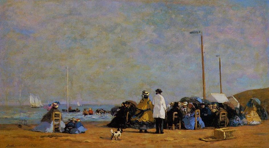
Crinolines on the Beach (1863), Boudin

Maybe the credit should be given to French landscape painter Eugène Boudin, who met Monet in 1858 and taught him to paint landscapes en plein-air and observe the effects of light and tonal value. Therefore, Boudin may have been the Grandfather of Impressionism. Check out that colorful sky!


This portrait of Denver the Cat exhibits a soft style, not unlike the skies in the above works by Boudin and Monet. These pastel colors may also be seen in works by Edgar Degas. The bottom of the painting may resemble a ballet dancer's tutu.


5. Pointillism/Divisionism/Neo-Impressionism (the late 1880s to the first decade of the 20th century) -- Seurat

Sunday Afternoon On The Island Of La Grande Jatte (1886), Seurat


Picking Peas (1887), Pissarro


Georges Seurat is credited as being the Father of Pointillism. However, my favorite Neo-Impressionist will always be Camille Pissarro. His compositions and color schemes are much more pleasing to me than Seurat's array of colored juxtaposed dots. While he still captures the lighting effects of Impressionism, his brushstrokes add texture without the obvious dots.


6. Modern Art/Post-Impressionism (1886-1905) -- Cézanne

Mont Sainte-Victoire (1895), Cézanne

Post-Impressionism evolved from the saturated colors of Impressionism and sought to reduce objects to their basic forms. The Father of Post-Impressionism is Paul Cézanne. Notice the shaded areas of color forming a patchwork of shapes that resembles later Cubist compositions. The 20th-century compositions will become much more angular and geometric, often using contrasting bold colors as opposed to the more analogous colors of this landscape.


7. Fauvism (1904-1908)

The Dessert: Harmony in Red (1908), Matisse
One of my all-time favorite artists, Henri Matisse, is also the founding Father of Fauvism. Inspired by the works of Impressionists like Van Gogh, Matisse also infused emotion into his paintings but instead of using the pastel colors of Monet, he used vibrant right-out-of-the-tube colors creating tension and contrast between warm and cool colors. In May 2011, on our trip to France and Italy, we stopped in Nice to visit the Matisse museum. Last Fall, in my post entitled, Top 15 Paintings that Use Primary Colors -- Red, Yellow, and Blue, I selected this Matisse work as #2 of my favorite Red paintings. Using unnatural colors was a way for the Fauvists to express emotion.


8. Expressionism (1905-1920)

The Scream (1893), Munch


The Chapman University blog about Expressionism describes the movement as "A group of artists that became associated with the Expressionism movement, tried to express or capture these feelings of uncertainty through swirling, exaggerated brushstrokes or jarring and violent lines and combinations of colors." Norwegian artist Edvard Munch is known as the Father of Expressionism. While on our June 2019 Baltic Cruise, we visited the Munch Museum in Oslo, Norway. Munch has also been considered to be part of the Post-Impressionist movement.


From Thuringewald (1905), Munch
In 1905, German architecture students Ernst Ludwig Kirchner, Fritz Bleyl, Karl Schmidt-Rottluff, and Erich Heckel became artists and formed the group The Bridge (Die Brücke) in the city of Dresden. Like Munch, their work was an emotional and psychological response to the world around them. While Munch's colors in his earlier works were more somber, German Expressionists' colors were more akin to its French Fauvist counterparts like Matisse. Matisse's paintings were happier and less anxious or angst-filled.


Which one of these cat portraits of Cheeky Tom is more expressionistic? Impressionistic? What about the use of color?


9. Cubism (1908-14)

(left) Ma Jolie, Picasso (1911-12) &
(right) The Portuguese, Braque (1911-12)
Cubism is yet another style that evolved almost to abstraction from the Fauvist and Expressionist movements. While they share some elements in common, Cubists went even further away from representational figures and forms to angular and geometric shapes and areas of color. Many will argue whether Georges Braque or Pablo Picasso is the true Father of Cubism. Even their works are quite similar. Supporting members of the movement included: Robert Delaunay, Henri Le Fauconnier, Albert Gleizes, Juan Gris, Fernand Léger, and  Jean Metzinger.


Nude Descending a Staircase,
No. 2
(1912), Duchamp


Dadaist Marcel Duchamp's Nude Descending a Staircase (No. 2) is a work that was rejected by member artists as being too futuristic. The Dadaism and Futurism movements (1909-13) were overlapped by the Cubist movement. While in high school, my older brother did some futuristic paintings. The one I remember most is of the Frazier/Ali fight.


10. Surrealism (1924-1966)

The Persistence of Memory (1931), Salvador Dali

Although many consider Spanish artist Salvador Dali to be the Father of Surrealism in art, French writer, poet, and artist André Breton began the movement as a response to Dadaism (the 1860s-1970s) during World War I. Other notable Surrealist artists include Antonin Artaud, Francis Bacon, Marc Chagall, Marcel Duchamp, Max Ernst, Lucian Freud, Freda Kahlo, Paul Klee, René Magritte, Joan Miró, Pablo Picasso, Man Ray, and Yves Tanguy. The irrationality of the images is said to unlock the creativity of the unconscious mind.


11. Abstraction/Abstract Expressionism/Action Painting (1943 thru the mid-1950s)


While the first real departure from Realism and toward Abstraction is said to have been fathered by Russian artist, Wassily Kandinsky, and other Expressionists in the early 1900s, the first generation of Abstract Expressionism didn't begin until 30 years later.


Still Life Interior (1941), Hofmann


German-American artist, Hans Hofmann, is also thought to be the Father of Abstract Expressionism, although he was apparently influenced by the work of Kandinsky. His early paintings were more Fauvist, such as his stylized still lifes and interior paintings. It turns out that Lee Krasner, future wife of Jackson Pollock, and an Abstract Expressionist herself, enrolled in Hofmann's art school in 1937. Later, in 1940, Hofmann experimented with drip paintings. Jackson Pollock followed in Hofmann's footsteps by dedicating his later career to Action Painting.


Fish Market (Seattle Market
Scene Sketch) (1943), Tobey


Water of the Flowery Mill (1944),
Arshile Gorky


Some say that Armenian-American artist, Arshile Gorky (left) or even Mark Tobey (right) is the true Father of Abstract Expressionism.


12. Pop Art (the mid-1950s and the '60s)

The Marilyns, Andy Warhol
Yet another controversy exists for Pop Art. Like Cubism, there are two artists -- Andy Warhol (1928-1987) and British collage artist Richard Hamilton (1922-2011) -- who get credited with starting the movement. We saw Warhol's exhibit at the Palm Springs Art Museum in the Spring of 2018. Let's not forget Roy Lichtenstein (1923-1997) and Robert Rauschenberg (1925-2008) both of whom are famous Pop Artists.


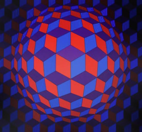
13. Op Art (the 1960s when JFK became President)

Cheyt Rond (1974), Victor Vasarely


Finally, the Founder of the Op Art movement is Hungarian-French artist Victor Vasarely (1906-1997), whom I've blogged about in several posts. Optical Art uses precise lines and contrasting colors often in geometric patterns to create optical illusions and even movement.


What style or art movement best describes the following two portraits of Buster-Baxter? How are they different? Which portrait looks the most realistic and why? What if anything makes you like one painting over the other?