Friday, February 28, 2020

Palm Springs 2020

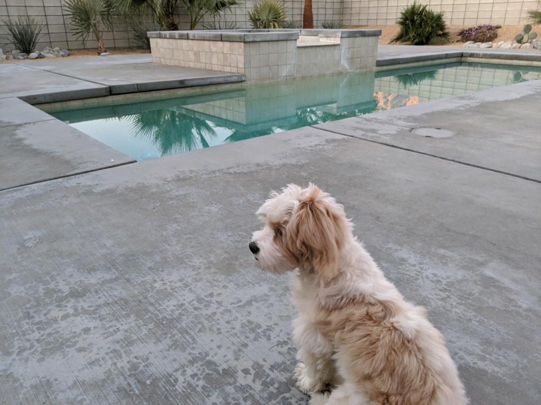
The weather is perfect for this year's trip to Palm Springs. Our new puppy is enjoying the fenced in property with lots of space to run around.

Still Life With Stuffed Friends


It's much preferred over a 3-day road trip in a car.


We frequented the City of Palm Springs - Dog Park, near the airport and City Hall. The wrought iron fencing and gate decorations are amazing!


They reminded me of the gates by Gustav Vigeland of Frogner Park in Oslo, Norway (see my post entitled, "Baltics (7 of 7) - Oslo, Norway").


But enough about my photogenic dog, there are lots more artful things to see in Palm Springs.There is a Chihuly glass sculpture on display at the Palm Springs Art Museum (see earlier post). I call this my "Chihuly Poolie", patterned after his floating glass objet d'art.


One of the current exhibitions on display at the Palm Springs Art Museum is entitled, "Alexander Girard: A Designer's Universe. The following Girard work is inspiring me to do a graphic design project with my 5th-graders and maybe my seniors. It is also reminiscent of Kandinsky's Circles. If you examine each of the 80 matchbox cover designs you will see words printed on the frames. This will work perfectly for my ~76 5th-grade students. I'm anxious to see the unique designs they will come up with and how they would contribute to a collaborative composition. 


I am further inspired by the exhibition at the Architecture and Design Center entitled, "Jim Isermann. Copy. Pattern. Repeat." I can envision using one of his graphical flower artworks as a replacement project for the hand and concentric circles project that was inspired by Salvador Dali and used to teach about warm and cool colors. This would be a creative way to combine the concept of pattern along with the idea of using non-traditional contrasting colors of different values. I think it would be fun to use two primary colors and the secondary color between them. The challenge would be to find a medium that allows the blending of colors (e.g. painting) rather than using watercolor markers that may not be available in a range of colors/tints. This would also teach color mixing, unless we decided to use one of the larger boxes of Crayola crayons. Outlining the shapes using white oil pastel or crayon may allow neater painting using watercolors to fill in the areas.


I was thrilled to find two large works by Abstract Expressionist, Helen Frankenthaler, who had been part of a previous exhibition at the PSAM that showcased 12 Women of Abstract Expressionism. This large painting was pretty close to the railing on the upper level of the museum so it was difficult to photograph.


The second painting was strangely monochromatic with only subtle changes in tones from orange to pink and a single dark stroke (that seems out of place). It's called "April Screen" and was painted in 1972. Another couple of patrons and I stood looking at it for several minutes until we each began to see something different. I love how abstract works are open to interpretation. When you look up into the sky at a cloud, you may see shapes that form something familiar, but in reality it is simply the atmosphere. It's still fun to look!


You may also enjoy this painting by Karl Stanley Benjamin, entitled "Interlocking Forms (blue, lavender, white)" (1959). This painting was in a section of the museum that included Op-Art works by artists such as Victor Vasarely (below). If you rotate it 90 degrees to the left it could be an abstraction of the rock formations photographed below.


If you're interested in exploring outside you will enjoy the natural beauty and unusual scenery at Joshua Tree National Park, including yucca trees and breathtaking rock formations.


Here's a painting by Sue Messerly that I found on the Internet that captures both the yucca trees and the rock formations.


Perhaps my most favorite find at the art museum is this two-sided modern (1980) Op-Art work by Yaacov Agam. It is intriguing to see another accordion-pleated work. Recall the double portrait of the Danish Monarchs that I found at the Rosenborg Castle in Copenhagen (see other posts).


This appears to have been assembled in vertical triangular strips arranged horizontally to form two distinct images when viewed from alternate sides. I should have photographed it from the front as well.

Monday, February 10, 2020

Mona Lisa

We visited the Louvre Museum in Paris, France, in May 2011. The largest museum in the world houses one of the smallest and most famous and valuable paintings -- Leonardo da Vinci's "The Mona Lisa". Knowing how popular she is, we entered from Portes de Lions and hurried past many other artworks to get to where she was being displayed. (As of 2019, that entrance is closed.) It was difficult to see her as she was behind glass and recessed. Alas, my photograph has my reflection in it!


I once had a book of illusions that suggested viewing pictures of the Mona Lisa upside down in order to have your brain perceive her smiling. Try it some time. The PTA's resident art teacher at the school where I volunteer likes to have her 5th-graders do a portrait of Mona Lisa. They turned out awesome!


When I teach my lesson on Johannes Vermeer, using his "Girl With a Pearl Earring", I tell my students that she is often referred to as the Mona Lisa of the North. What a great way to integrate art with geography!


Today, one of Seattle's portrait artists -- Troy Gua -- enjoys combining two famous people into a single morphed image. Here is his George Washington and Mona Lisa combination, entitled "Made in Heaven." It makes me wonder what Gilbert Stuart and Leonardo would have thought about this painting!


In one of my posts about the Baltic Ports, I talk about seeing "Madonna Litta" at the Hermitage Museum in St. Petersburg, Russia. Another portrait painted by Leonardo da Vinci (and Giovanni Antonio Boltraffio) equally small like his Mona Lisa.


Sunday, February 9, 2020

Artist Jeopardy

Back in 1998, during my 'Projects, Projects' seminar with the Interurban Center for the Arts
at Green River Community College, we played the following (updated) Jeopardy game
with prospective art docents from local school PTAs.

                             EXPRESSIONISTS


                                                         MASTERS


                                         MODERNISTS


Saturday, February 8, 2020

Talking Art & Travel

I am planning to give a talk entitled, "Art of the Baltic Countries", at local senior centers in March and April of this year. My presentation includes the content of the seven posts about the Baltics and lasts 90 minutes.


"Travel to over seven cities in seven countries – Copenhagen, Denmark; Stockholm, Sweden; Helsinki, Finland; St. Petersburg, Russia; Tallinn, Estonia; Warnemünde (Rostock and Berlin), Germany; and Oslo, Norway – and discover art along the Baltic Sea. This presentation is a visual journey through art museums, churches, quaint villages, and historic architecture and landmarks."


While touring these countries you will find Art in all sorts of places. The architecture is often older than what you may find touring North American cities and amazingly well-preserved. The buildings themselves are quite ornate and are interesting on the outside when viewed from a tour bus or on a guided boat ride. Hidden treasures are found inside buildings, such as castles and palaces, churches, courthouses, theaters, and of course museums. This double portrait depicts Frederik IV and his sister, Sophie Hedevig, in a room at Rosenborg Castle in Copenhagen, Denmark.


I enjoyed seeing the colorful buildings of Denmark and the statues and sculptures scattered around the cities we visited. The Hop-On-Hop-Off buses were an amazing convenience as were the guided water tours. Many of the cities we visited are made up of several islands with bridges and waterways meandering through them. It was much easier to photograph the scenery from an open watercraft than from inside a fast-moving bus. And through a window! The tour buses make several stops, though, in a place like St. Petersburg, you need to stay close and with your group.


While on a Princess cruise that covers an 11-day trip stopping at seven ports, you are encouraged to spend your time wisely. The excursions are totally worthwhile and the guided tours a fascinating way to soak up all the history and important not-to-be-missed sights. One could spend weeks visiting the 5 buildings comprising St. Petersburg's Hermitage Museum in order to see its 3 million works.


It's also fun to explore on foot and absorb the local culture up close. In order to see this bronze statue of "The Little Mermaid", by Edvard Eriksen, you need to take an early morning walk to avoid the masses of tourists flowing off the buses. Even from the water, your view of the statue may be obstructed by the swarms of people.

We got to visit Copenhagen for three days prior to our cruise and made use of our time quite wisely. The 3-day bus pass was affordable and perfect for getting around the city without taxis. Even if we repeated some of the routes to enable getting to a specific area again, we had the option of listening to the guide or simply catching a glimpse of something we may not have seen on a previous trip. We were often on the upper level (weather permitting) which afforded yet another perspective.


Sunday, January 12, 2020

Math and Science in Art

"The Gardener" (1882-3), Seurat 

Many areas of the sciences use art to visually convey information and teach subject matter. What a scientist may see under a microscope can be converted to stipple drawings. Scientific illustration (of plants, insects, microscopic images, microbes & viruses, wormholes, etc.) can be a career in which an artist's skills may be employed. It's fun to explore the microscopic patterns in nature. Learning to recognize a pattern and using repetition are skills an artist uses to create interest. The artwork of Kehinde Wiley is a great example. Georges Seurat and other Pointillists used colored dots placed adjacent to each other to create light and allow our brains to blend the colors together when viewed from far away. This technique is also called divisionism (chromoluminarism).


You may need to study Anatomy to be able to draw figures accurately. Like creating a sculpted figure you would start with the armature (the bones) to understand the proportional size. The muscles begin to add form and the skin the outside texture. Learning to draw can be a valuable skill.


Architecture is like studying the anatomy of a building. From the girders and studs to the interior drywall and exterior siding and roofing. Drafting is both an art and a profession. This kind of drawing requires an understanding of perspective. Magnetic building tiles purchased online are wonderful toys for kids to learn the anatomy of buildings using geometric shapes in attractive colors. Yesterday, we babysat a pair of friends' kids who absolutely loved erecting buildings. What amazed me was how instead of making the traditional tower this child made an actual floor of a building complete with rooms.


Check out the Dali Museum in Florida. The large free-form geodesic glass bubble known as the “enigma” is made up of 1,062 triangular pieces of glass, stands 75 feet at its tallest point, a 21st-century homage to the dome of his museum in Costa Brava, Spain. Inside you'll find a helical staircase – recalling Dali’s obsession with spirals and the double helical shape of the DNA molecule.


I don't like it when people say, "Oh, I can't even draw a straight line." Lines don't have to be straight, but if they do, you could always use a ruler. Kids need to learn how to use rulers not only for making straight lines but also for measuring. I like to do enlargement exercises with students so that they may learn about proportion using measurement and multiplication. For Valentine's Day one year, we took a poster-sized picture of Elvis Presley and divided it up into enough pieces for the class to blow it up to three times the size. A parent helper then turned it into a bulletin board (another fun group project). Years later my Kent school did something similar for Martin Luther King Day.


Photography is an art, and some artists like Johannes Vermeer used camera obscura to aid in laying out his painted scenes before the camera was invented. Someone like Norman Rockwell had the luxury of using a camera to capture his subjects.


The art of illusion is pretty much what allows artists to create paintings and make them look three-dimensional. Shape & Form (spatial reasoning) – how to define forms and create the illusion of space. Artists also use the element of space and associated principles to create depth. Light & Shading show where light is coming from and how shadows are formed based on time of day. Next time you view a landscape see if you can surmise the time of day when the artist painted it.

Artists like:
M.C. Escher,
Salvador Dali,
Georges Seurat,
Victor Vasarely,
and Johannes Vermeer, 
were masters of illusion.


Tuesday, November 12, 2019

More Seniors' Art


Recently, I revived a previous lesson inspired by Wassily Kandinsky for a group art project with seniors. We were inspired by Kandinsky's 'Color Study: Squares with Concentric Circles'. I introduced the project by likening its pieces to Granny squares.


The project uses deli paper sheets that are taped atop a piece of white computer (or construction) paper that has a black outline of a 4"X4" square printed on it. You will have to trace a square if you use construction paper.


Students are instructed to draw/color abstract (imperfect) concentric circles to fill the entire (interior) square space with color. Even Kandinsky left white space occasionally! We used rather brightly colored Sharpies. You may also like using brush-style Sharpies.


I use liquid starch (STA-FLO brand) to decoupage the thin deli paper squares onto a stretched canvas. Oh, and the paper has a waxy side, so be sure to use the other side when you apply markers to your square. Even so, some markers will want to bleed through, which is another reason for a paper background layer.

Be sure to plan out your composition so that you have an even number of 4-inch squares. I recommend not purchasing your canvas until you know the proper dimensions. Sometimes there are absences and you may need to make an extra square or two. It's fun to ask the teacher of the classroom or another art volunteer to create their own piece to complete the group project.

For our next project, we will be doing scratch painting on prepared scratch paper art pads. I remember making my own scratch paper by coloring a piece of paper (with crayons or oil pastels?) and covering it with black (tempera?) paint or India ink. I'll have to investigate the process and make some of my own.

Using a pointed wooden stylus (toothpicks may work in a pinch), students will scratch lines to reveal the colors underneath. We will be creating our own flowers or try our hand at making butterflies. Some scratch pads come pre-drawn with gray images for budding artists to trace and reveal the underpainting colors. This is similar to adult coloring books, though seemingly too challenging for some.

For inspiration, I like to use a website that shows the top 10 flower paintings from the 16th century thru modern day. Many of the most famous artists are in this group: Eduard Manet, Claude Monet, Georgia O'Keefe, Vincent VanGogh, and Andy Warhol. You may also recognize Jan Brueghel the Elder, Albrecht Durer, Henri Fantin-Latour, Katsushika Hokusai, and Judith Leyster. The last two artists were new to me. VanGogh was probably familiar with the work of Hokusai since he often used the works of Japanese artists as inspiration for his own artwork. See my June 2019 post "Japanese Art and VanGogh".


So we didn't use the scratch paper and instead used tempera paints for our flowers. Then, we did butterflies on these beautiful scratch papers.


Our butterflies were inspired by Egyptian art from 1350 B.C., the Renaissance, a painting by Salvador Dali, and Damien Hirst's "Kaleidoscope" series of large paintings in which his patterned pieces are entirely composed of butterflies.

Continuing with the theme of butterflies, for New Year's we constructed them out of origami paper and pipe cleaners. The paper needs to be square and it is simple to convert almost any (thinner) rectangular sheet of paper into a square. Fold one corner diagonally toward the opposite side, then cut off the excess. Each butterfly uses two squares of the same size paper. It's fun to use two different patterned papers.


The inspiration for the butterflies was New Year's fireworks radiating out from a center point. Before getting to this project, I highlighted the works of Fauvist artist, Henri Matisse. Matisse liked to use paper cutouts. I also showed pictures of his museum in Nice, France, from our trip in 2011 and his works on display in the Moderna Museet, Stockholm, Sweden, from our Baltic cruise in June 2019.


Before Christmas, we made greeting cards using bubble-cut images printed off the InterNet. We then embellished them with stickers and markers.


For the Lunar New Year or Chinese Year of the Rat, we decided to make rat cookies using a Mickey Mouse cookie cutter that was bent to make a pointier nose.


While we baked and iced store-bought cookie dough and iced the cookies using butter-cream icing, the seniors decorated them. Some seniors also helped cut out the rat shapes.


We constructed pie slice boxes out of yellow tagboard and decorated the cookie boxes to look like cheese wedges using (black, brown, orange, and red) washable markers. The holes were drawn in marker using organic round shapes of different sizes, often colored in. The end of each box had a cute rat label saying, "Happy Chinese New Year 2020". The boxes were a fun way of transporting the cookies and made a nice gift for the caretakers.

Saturday, November 2, 2019

2019 Pumpkins


The first pumpkin that I carved this year was in honor of the coffee shop I now frequent since our recent move. The Black Gold Coffee Company is located in Black Diamond, WA. The letter 'O' in 'GOLD' is meant to be a coffee bean. The black diamond shape in the unlit daytime version is a bit larger than I envisioned it and the coffee cup handle a bit too small. The owner immediately recognized that I was going for a coffee cup pumpkin.


Here's the night time version. If I had simply carved out the letters and carved an outline of the diamond it would have looked like a black diamond. I not only needed a toothpick to stabilize the 'GOLD' but the letters themselves began to shrink after a couple of days. 


This year I carved pumpkins with my family. There were five of us carving both store-bought and home-grown pumpkins. My wife did a Martha Stewart-inspired polka dot pumpkin, executing perfectly matching hole cutouts. My daughter did a monster from "Stranger Things", and I carefully peeled off lines to form the web design for Spiderman's head. My sister-in-law made a ghoul for hers and her husband a more traditional pumpkin face. Some of the pumpkins had pretty thick skins, so there was a lot of sawing!


Since three of the five awesome creations were taken home to Enumclaw and Seattle, I decided to carve two more pumpkins. One is the Cheshire Cat (left) from Alice in Wonderland and the other is the character Groot (right) from the movie Guardians of the Galaxy.


All of these pumpkins show a variety of carving techniques that are fun to try. It's also fun to carve different shapes and sizes of pumpkins. Your pumpkin doesn't have to be in the traditional orange color and may also be painted. Think about what you want on your pumpkin or simply dream up a spooky face. It's fun to remove the darker orange skin and even carve to different depths for a variety of values from light to dark.

Here are some more examples from a previous year. I am thinking of carving a witch's face out of one of those bumpy gourds next year.

The warts would already be there!